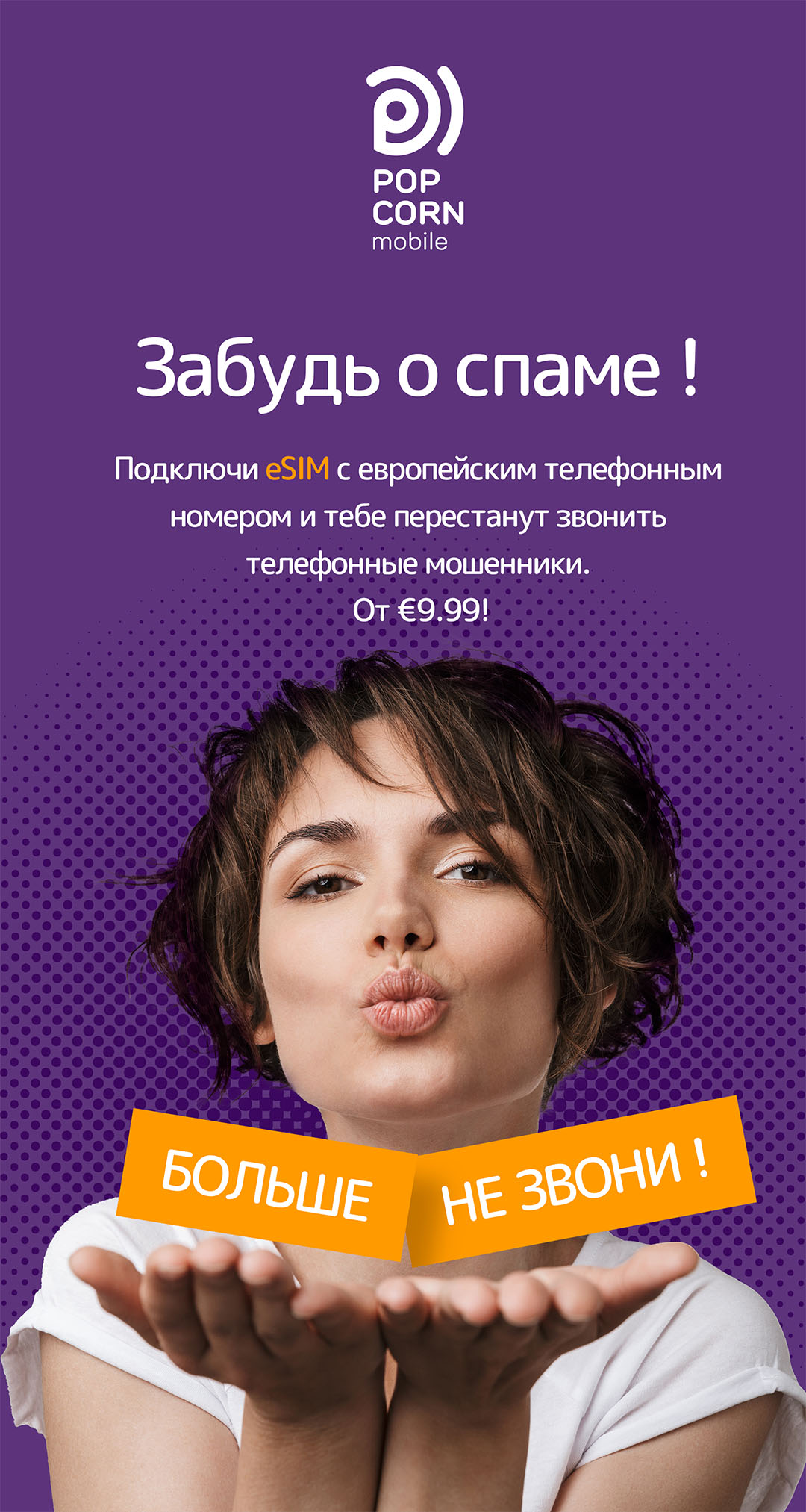
Popcorn mobile is a revolutionary new mobile carrier that provides profitable data and voice plans around the world. We have developed a brand, logo, website and social media strategy.
Challenge
How to save money on the Internet when roaming? How not to change your mobile number every time you visit another country? What if you’re moving from country to country all the time? Popcorn mobile offers a product focused on digital nomads, slow travellers, and students of foreign universities. The main promise of Popcorn is “Fast and reliable Internet around the world” and the main feature is that SIM card data is delivered to the embedded SIM card in your phone in a few clicks without visiting an offline office.
We were asked not only to create a bright, memorable brand, but also to convey the meaning and benefits of a new product in a simple and clear form to the audience.
Approach
We analyzed the competitors and similar products: advantages, disadvantages and pricing.
Local carriers
Examples: Beeline, Vodafone, Movistar, Inwi.
Advantages: low price.
Disadvantages: high price when roaming, it’s impossible to buy a SIM card in advance, not easy to find where it is sold, and it only works in a limited region. Sometimes it’s a challenge to choose the right data plan due to another language.
Travel SIM cards
Examples: DrimSim, GigSky.
Advantages: low price, possible to buy in advance.
Disadvantages: focus on traveling to a specific country, hidden payments, limits for a minimal deposit.
eSIM Services
Examples: Airalo, Yesim.
Advantages: low price, possible to buy in advance, a large number of countries and coverage areas.
Disadvantages: the validity period is limited, no mobile numbers and voice plans for some cases.
Audience needs
We analyzed potential customers using data from the mobile provider analytical reports and different types of surveys like Yandex Vzglyad, and offline polls. For instance, we’ve discovered that:
- More than 30% of mobile users enable roaming while traveling without buying a new SIM card
- Users will prefer a more stable Internet speed to ease of connection
- More than 40% use mobile messengers for communication
Based on the research results and aligning them to the capabilities of the mobile provider, we proposed the brand name, character, colors and competitive features.
Naming and logo
The word Popcorn is associated with simple, light and positive emotions. We choose the cell phone signal strength as the base for the logo. Three stripes symbolize the best possible signal strength. The brand's promise is: “Fast and reliable Internet around the world.” The color scheme and shape are based on competitive analysis and distinction from competitors.
Website
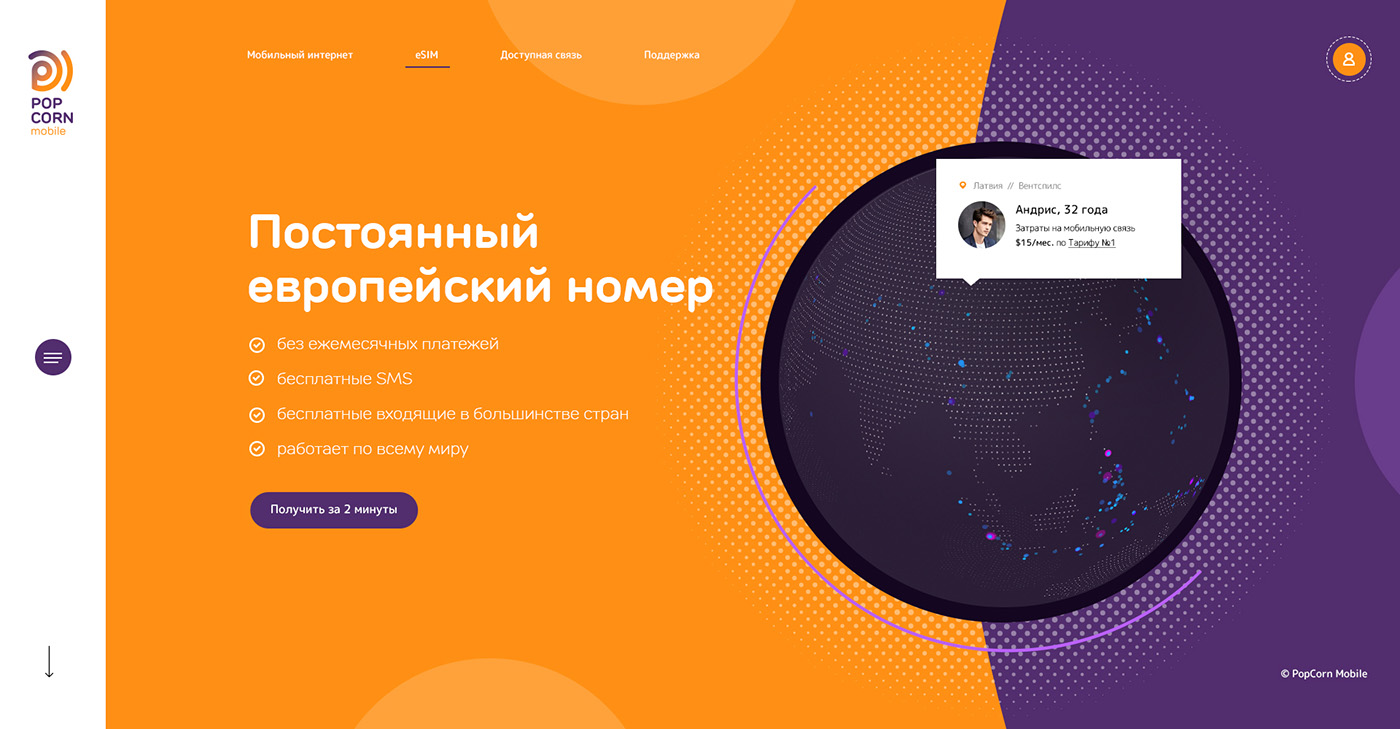
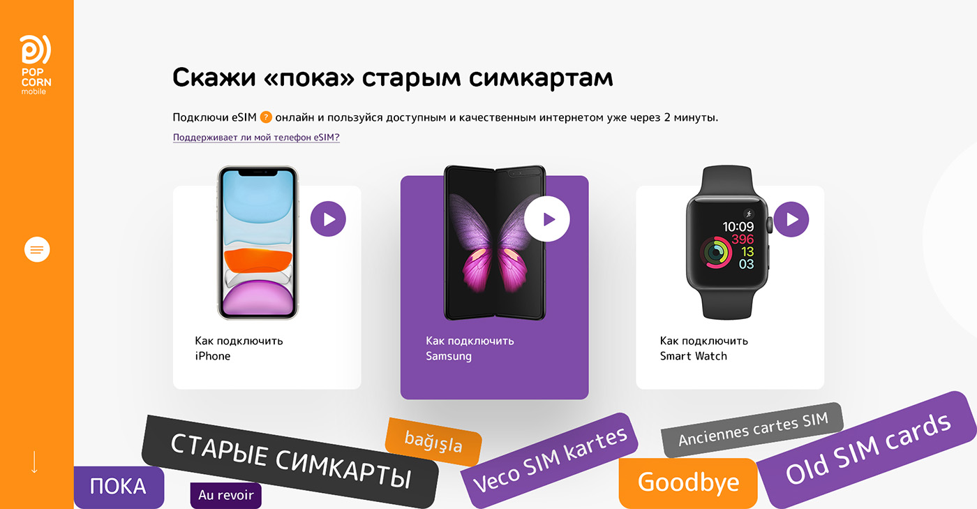
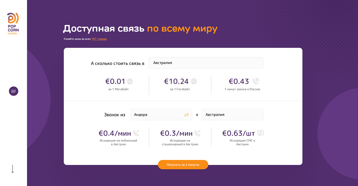
The Popcorn Mobile website keeps the principle of simplicity and clarity that we associate with a good product. To achieve the goal, we separated user scenarios:
- Introduction and purchase. We refined the available information and proposed an easy-to-read landing page of six slides that present the product, pricing and the how-to-use process.
- Top up account balance in a couple of clicks.
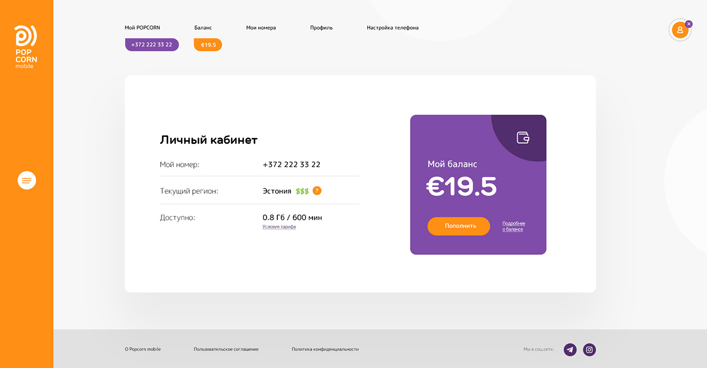
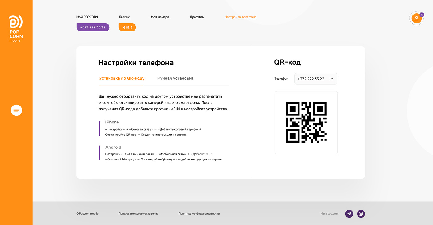
- A personal cabinet, where the customer can get details of debits and deposits, change the plan and profile details.

SMM strategy
The sales strategy was focused on starting in Russia, and social media were chosen by the client as the primary channel as a hypothesis. We analyzed the competitors` activities: content, visual, followers and messages.
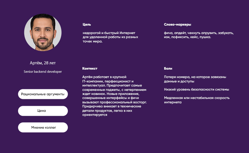
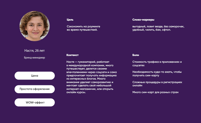
Based on competitive analysis, product features and user research, we have identified several audiences:
- Travellers and digital nomads
- Business trip workers
- Geeks
- Students
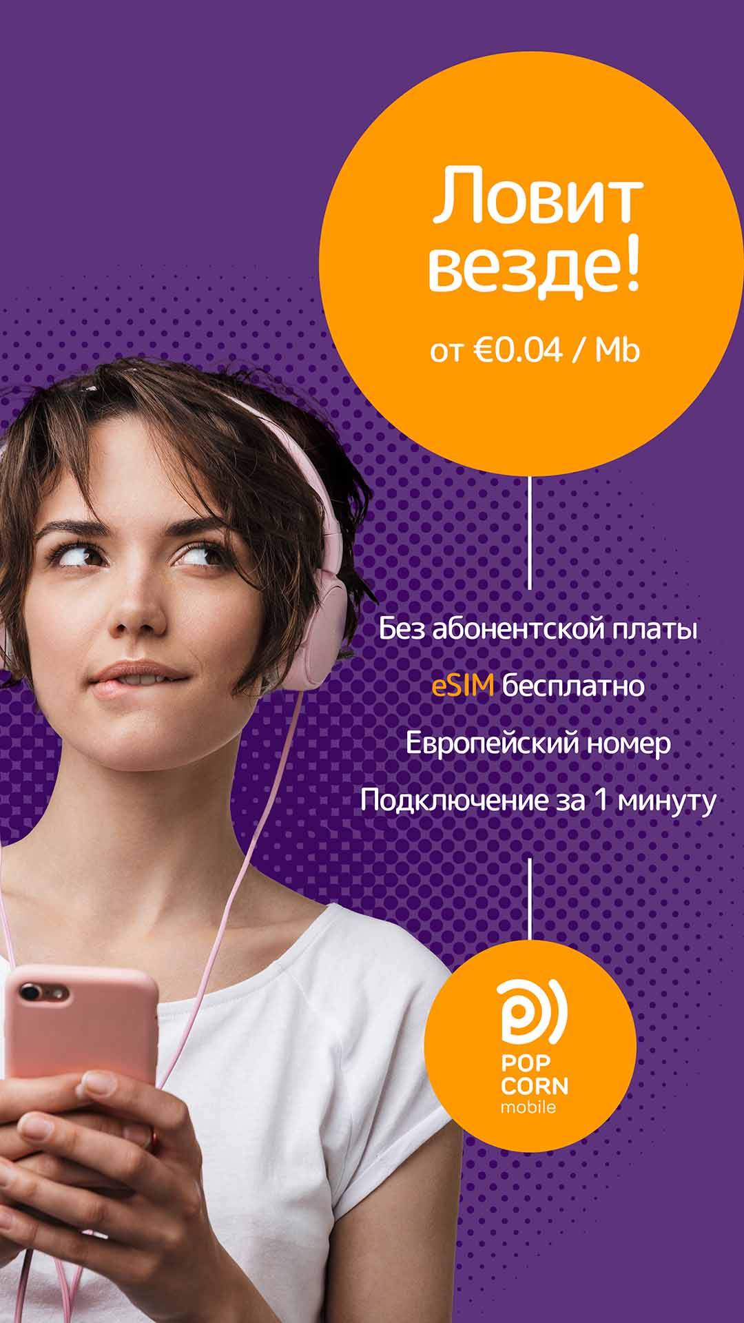
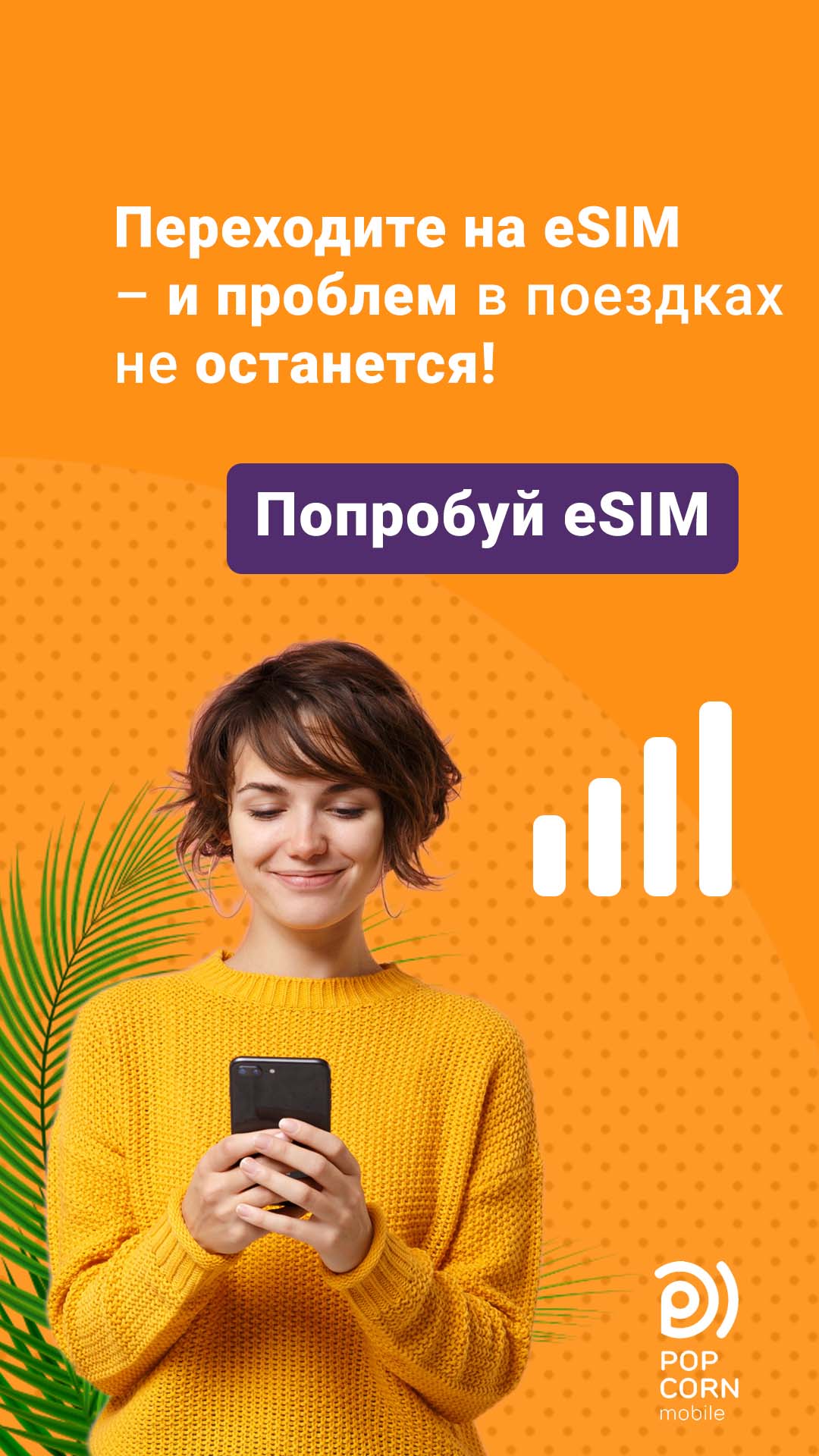
Each audience was divided into several regions, where Popcorn mobile offers different price packages. Based on targeting, we proposed more than 35 advertising campaign sets with unique visuals and text.
