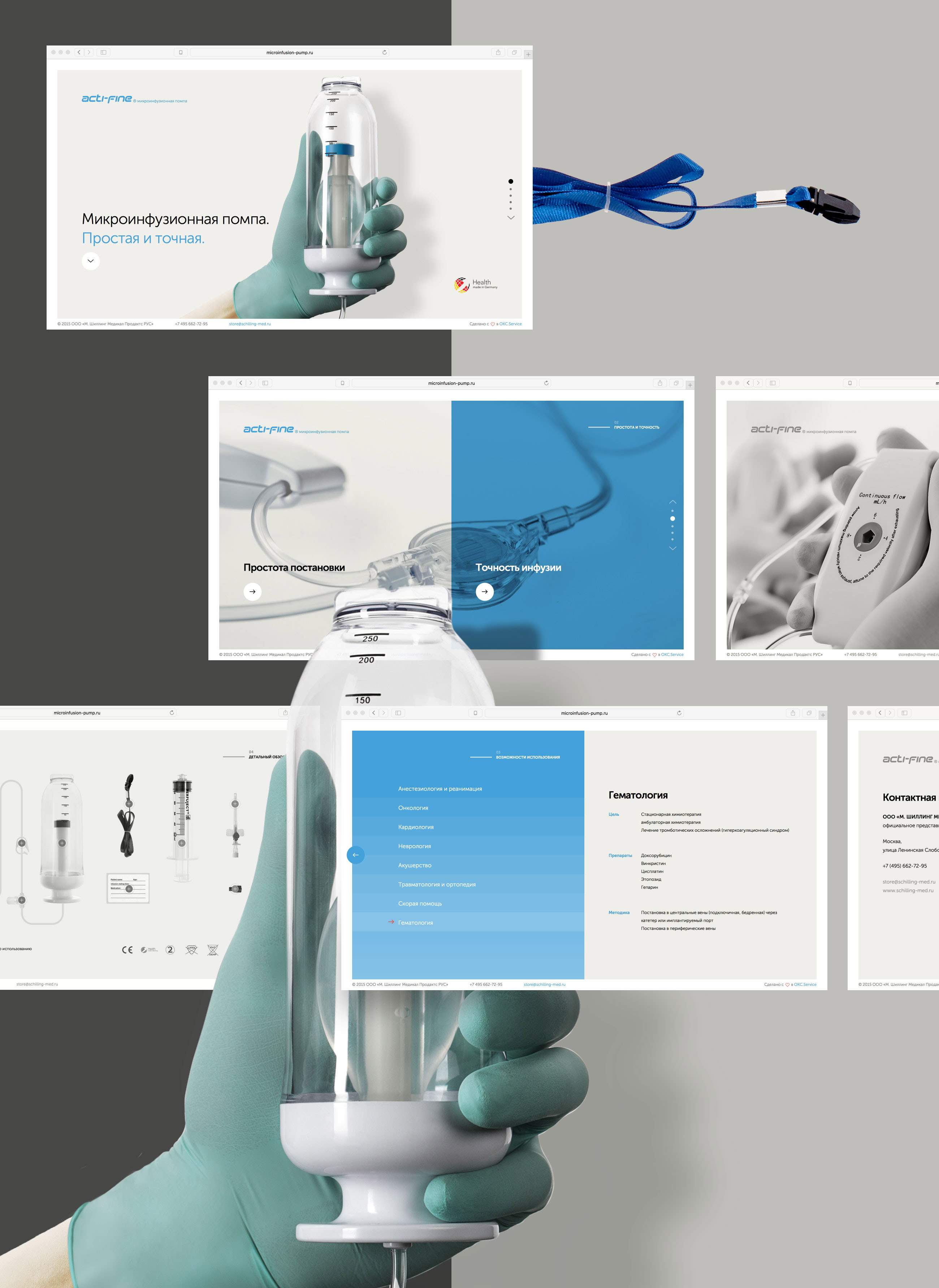
The promotional site for a small thing that helps save thousands of lives. A cool thing doctors will appreciate. Acti-fine is a precise microinfusion pump that probably is the fastest to set up. This feature matters when every second counts.
Goal
Acti-fine Microinfusion Pump is an innovative product supplied by M. Schilling GmbH Medical Products. The infuser would be of interest to doctors due to its ergonomical design and to purchasing agents due to its affordability.
We needed to create a promotional website that would attract specialists' attention with the first click and that would provide detailed insight into the benefits of the product.
Together with the client, we analyzed the product's competitive benefits as well as target audience needs and criteria for making a buying decision.
Solution
The website for the Acti-fine Microinfusion Pump was based on the onion principle. The basic information targeted for “scanning” customers is conveyed visually and through concise headers. The full information is shown when the customer expresses interest in the details.
The main message that Acti-fine Microinfusion Pump is easy to use and is precise, is also brought out by the minimalist design and high-quality images of the product.

It is not uncommon for good products not to have enough high-quality images. We did the photoshooting, image retouching, and detail rendering for the website. Our goal was to convey the sensation of a flawless product that one can “touch”. That's why a doctor's hand with an infuser became the focus image.
We focused on user experience, interface reactions and usability.
To achieve the website performance, we additionally optimized scripts and css styles, served separately retina and non-retina images.
Awards
Outcomes
There was substantial growth of user involvement in comparison to a generic website.
low bounce rate
high visit depth
average visit time

Of course, its a doubly difficult to create a good promo website for a medical device: to convey the basic idea to target audience, and to make high quality images of the product. All the project goals have been achieved in time and we got a really sucsessful tool for promotion.”