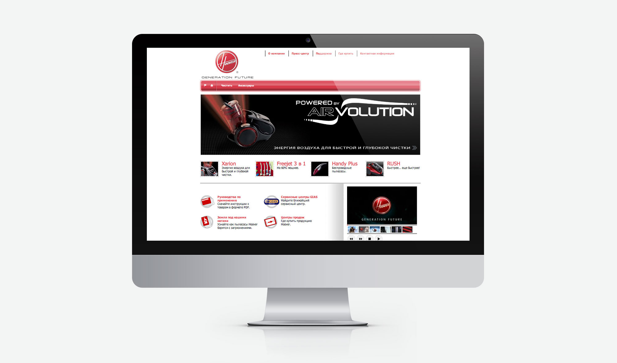
Hoover is a world famous vacuum cleaner brand that gave name to this home appliance. Hoover in English means “vacuum cleaner”. We created and supported the company’s new website.
Hoover is a part of Candy Hoover group; creation of the Russian website for Hoover was part of a large-scale project on the company’s websites localization and promotion.
To improve customer experience in comparison to the original Italian website, we created several features:
- The journey to the microworld of dust and particles which helps to choose vacuum cleaner
- Comparison of products
- Notebook for favorite products
- Detailed description of technologies
- Product gallery
- “Where to buy” and “service” sections.
We employed the same principle as with the rest of the project websites: to be one step ahead. From 2004 to 2008 two different versions of the website were created.
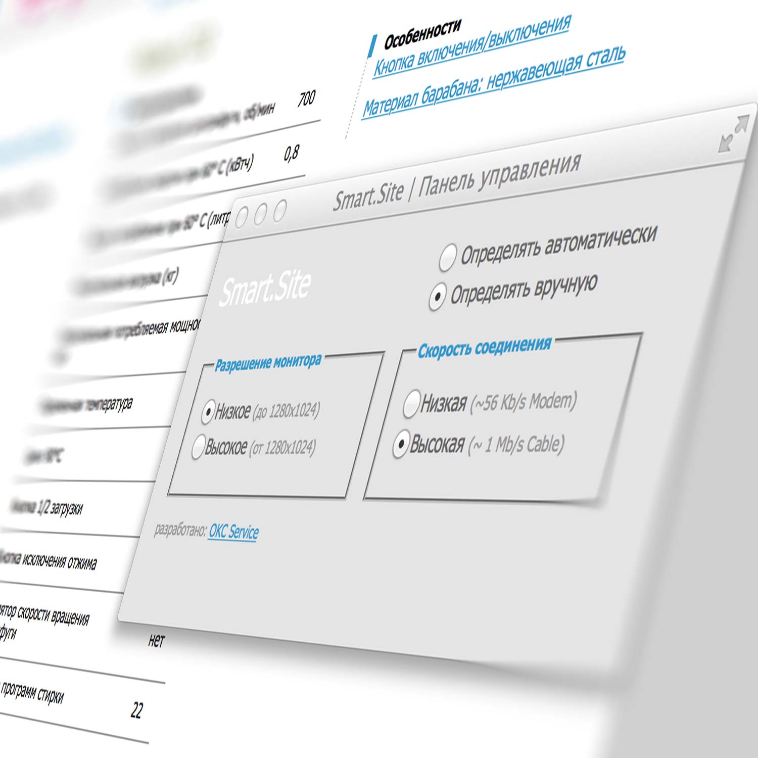
In the same manner as in Candy project, CMS was created for ASP/Oracle platform and the groundbreaking (for the day) SmartSite responsive technology.


Responsive website
Candy Hoover group websites were, perhaps, the first to apply the concept of responsive design. We created and used SmartSite technology that allows to:
- Determine the user screen resolution
- Determine the connection speed
For instance, we showed images with a smaller resolution to dial-up Internet users and increased the layout as well as the font and image size for wide screen desktops with the fast Internet.
Outcomes
of collaboration
versions of the website
work hours of priceless experience
