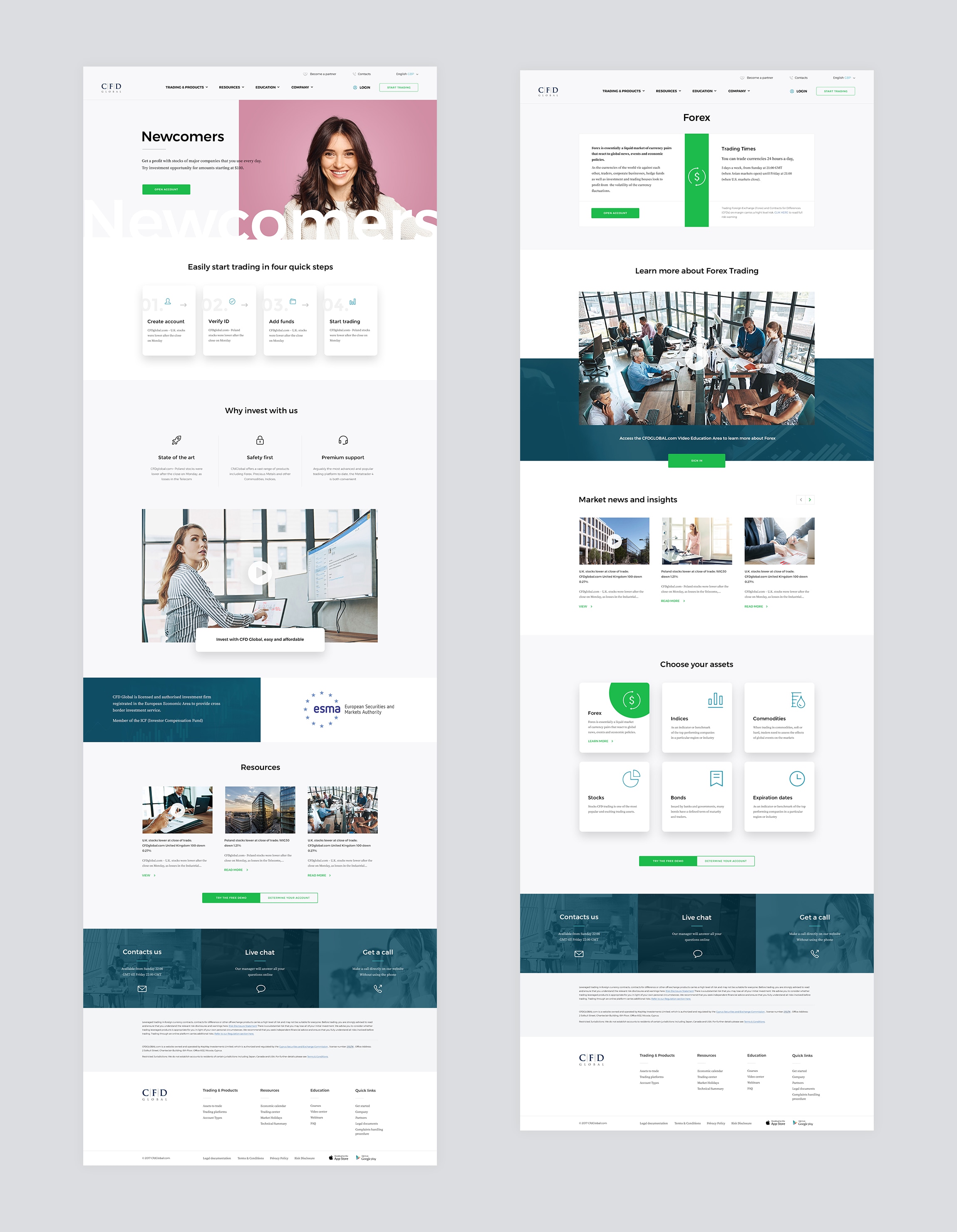
How to make money on cryptocurrencies and shares? The new CFD Global website is created for people who want to earn a profit from major companies they use every day.
Background
CFD Global offers an investment solution for both professional traders and newcomers.
Our goal was to create a visual language for the leading company in a highly competitive environment, emphasizing their expertise and
Usually, in the design of
Insight
Our big idea was that CFD Global is a personal brand, suitable for every investor, regardless of their amount of investment or level of experience.
For newcomers, we suggest a simple quiz to determine their investment experience level and offer them the most suitable strategy.
For professionals we get straight to the point and let them discover current events on the market, reviews, show them indices in live mode, and the specific advantages of trading with CFD Global.


We were looking for an image that would make people remember the company at first sight.
To do this, we conceptualized the right above the fold content, which shows that every newcomer can become an expert, and every expert was once a beginner.
From the first screen, we offer the user two journeys: the journey of a professional trader and journey of a newcomer.
We used an interactive
CFD Global works worldwide with the people of various professions — that’s why we offered local images for Europe, South America, and Asia: the main CFD markets.

Mobile experience strategy
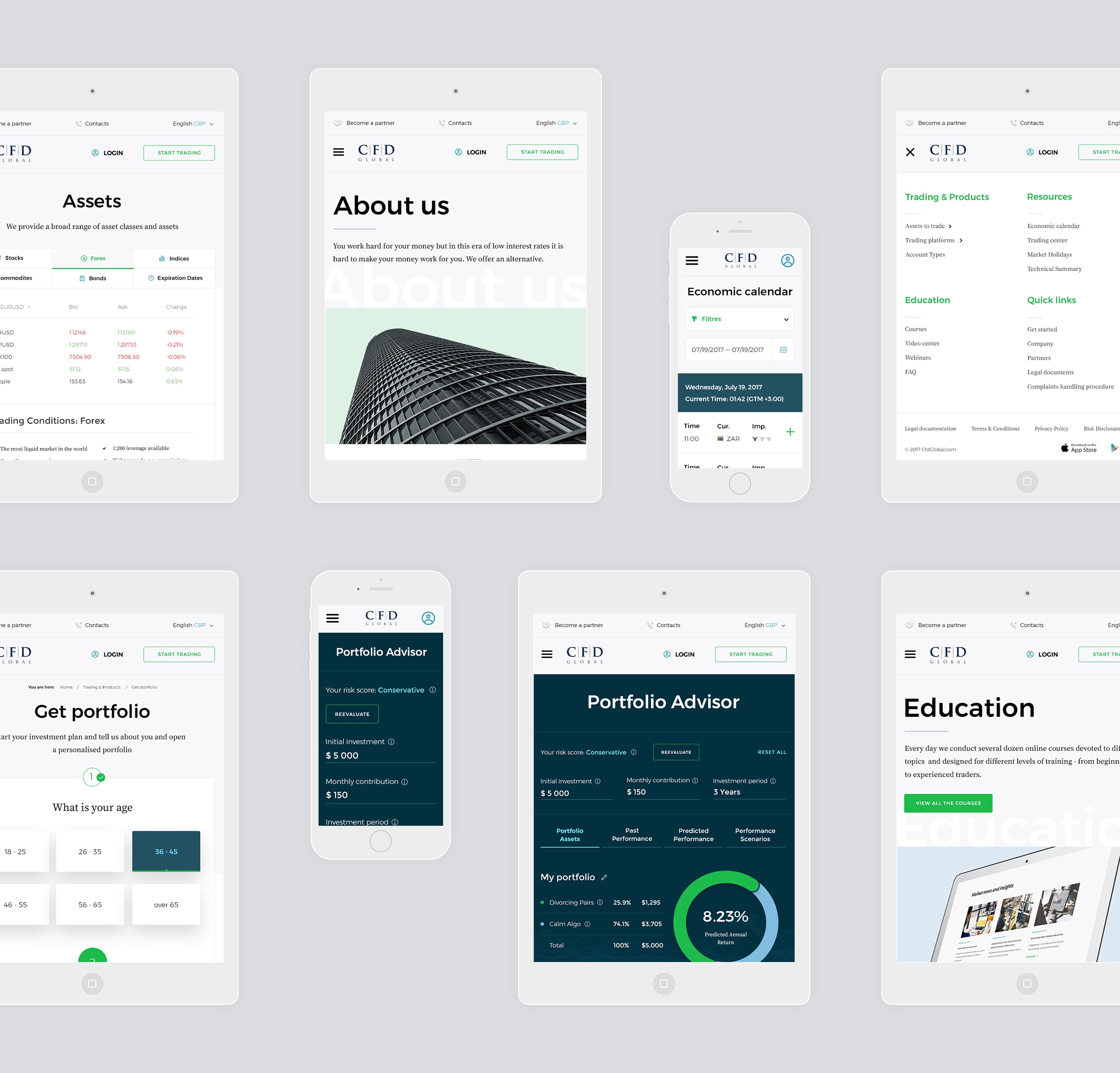
Our goal was to provide the absolute experience regardless of user’s browsing device. Users expect the mobile experience to be as good as desktop, without any compromise. Our mobile design is created uniquely, with a deliberate focus on every responsive element.


Experience level
A short quiz for newcomers helps to determine their trading experience level and allow them to find the most suitable investing strategy.
We care about simplicity when showing their profit opportunities and risks.
“Once Bruce Lee said that the successful warrior is the average man, with

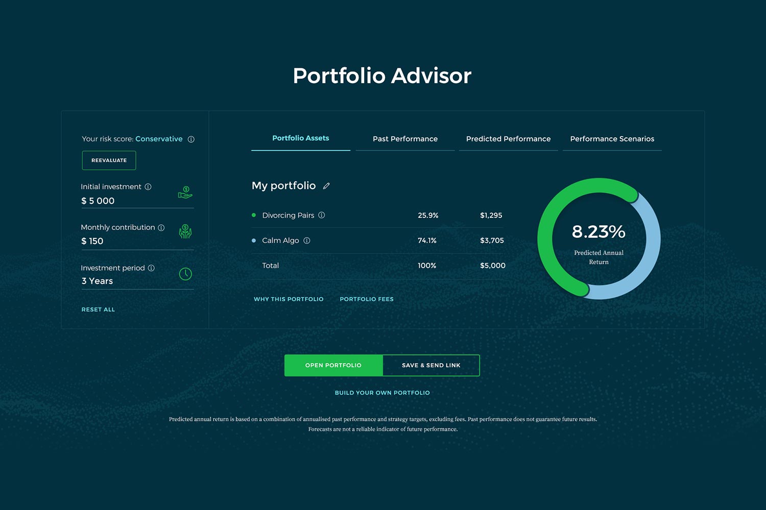
Portfolio advisor
Based on the user’s preferences on liquid asset value, investing period and acceptable risks, the advisor presents the most suitable portfolio. It allows the user to see the past and predicted performance, to customize the set of shares or currency pairs, and to find the best investment strategy.