Vazaro Concept Store is a retail network of exquisite kitchenware and household accessories. We have created the powerful eCommerce platform which drives sales.
Goal
To create the best kitchenware online store. The previous website was created in 2007 and had lots of underused potential for growth that we offered to unlock. Yet all the advertising campaigns and SEO were linked to the old version informational structure. We had to approach the change gradually and with caution.
The client set us a task to create a new website, responsive and user-friendly, that would drives sales for the next level.
Solution
We researched consumer behaviours and expectations on the old platform and the new website prototypes. The interface we developed focuses user attention on the product itself and benefits of the purchase. We made sure navigation was easy and familiar to the primary audience.
In this case study we are going to tell you about aspects of online store development targeted primarily for women.
Deliverables
e-commerce strategy web integration ux front-end seo copywriting content smm
Release date
24.08.2013
view case

Analysis
It was necessary to fix problems on the old website that were typical of any eCommerce platform: an overly complicated catalogue; pages with too much information; inconspicuous “buy” buttons, and so on.
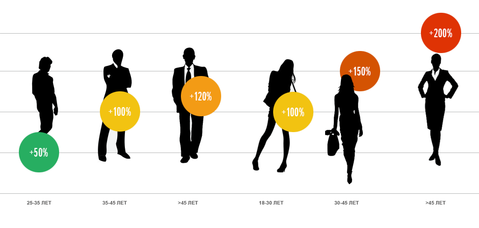
Then we discovered an interesting phenomenon: the highest order conversion was shown in the male population from 25 to 35 years old, yet this demographic group was not the largest in relation to page views. Consumer behavior analysis has shown that there was a big gap in conversion among women over 30 years of age. This was a significant loss, since female visitors represent 60% of the audience.
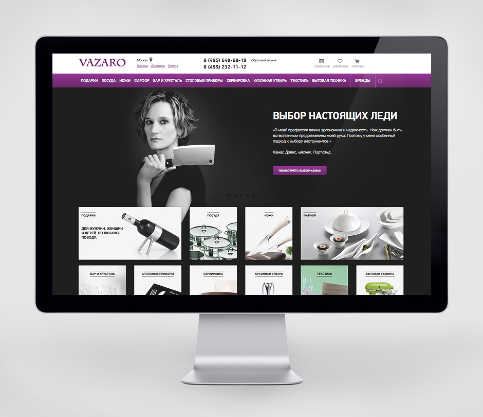
Traditionally, the website development starts with the front page. We, on the other hand, began by developing landing pages prototypes; that is, we worked catalogue pages, that are major points of entry. They determined the composition and formatting of the website as a whole.
Structure
One of the primary goals was to create a catalogue that would be user-friendly. Items used to be stored in the client's WMS and arranged in the way most convenient for the store itself. Customers needed a completely different category distribution.
We gave logical names to different sections; those names were derived from search phrase analysis and grouped by frequency. We needed to preserve the catalogue addressing on the old website despite the dramatic renovation of the structure. This was our secret ingredient.
Frontend
Responsive website layout and gesture support allows to conveniently view it on tablets as well as desktops.
We also paid special attention to page load time.
For dynamic image loading we use “smart” two-level caching: one on servers and the other on user browsers. It allowed to cut page loading times by 3.5 times.
SEO
The most difficult task was to carefully replace the old website with the new one without any search traffic loss. We have proven that it is possible even for such complicated cases as the old website.
At the time of the website creation, long unformatted texts at the bottom of every landing page were still in trend.
We set standards of content formatting and introduced the concept of non-existence of so-called “SEO texts”. Such texts were replaced with well-arranged information on brands and series with the useful information for the customers.
CMS and integration
We perfected the integration mechanism for the warehouse management system and introduced the content management system based on our studio CMS.
Catalogue tables contain millions of entries; the data transfer (images and catalogue) alone takes several hours. That’s why we incorporated quick partial synchronization together with the slow full one.
The website is integrated with the payment system, delivery services, SMS-service, Yandex.Market and advertising campaigns.
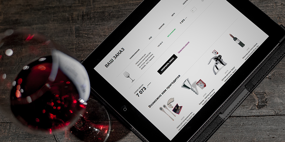
User experience is all about details. We paid special attention to little things that would feel natural for the customer.
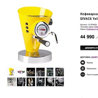
Catalogue
- Landing pages
- Smart filters
- Photo and video galleries
- Product views 360°
- Product comparison
- Selected items
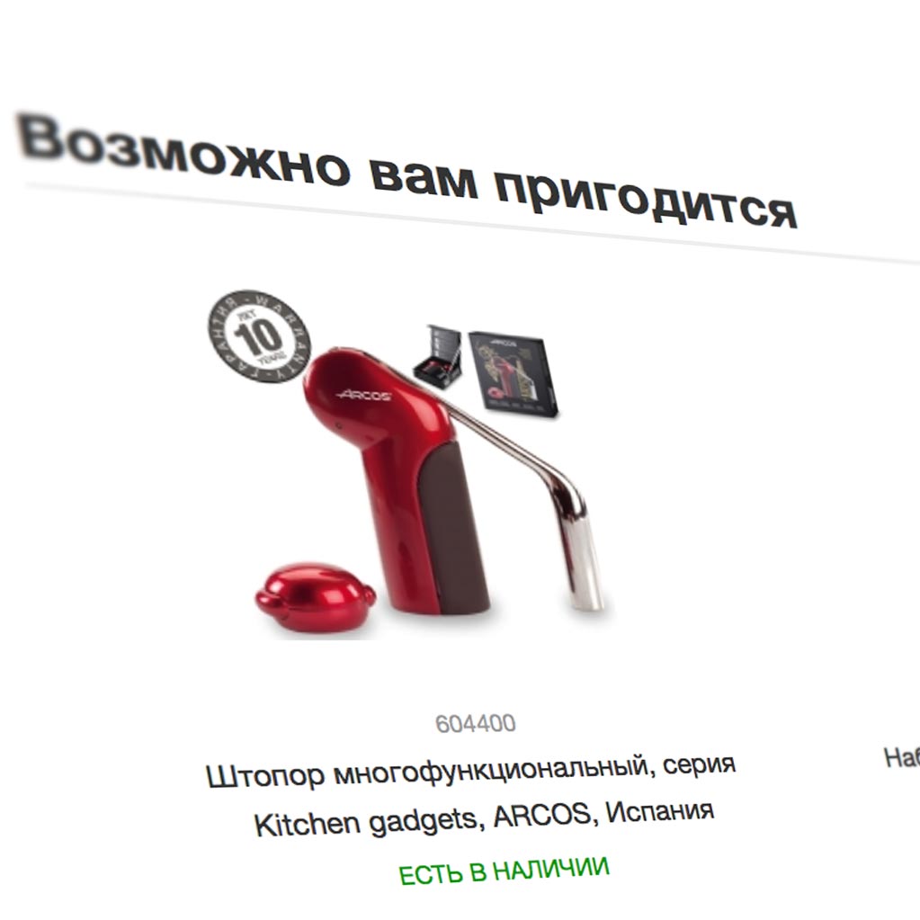
Personalisation
- Geolocation
- Estimation of delivery expences
- Smart product tips
- User account
- Discount program
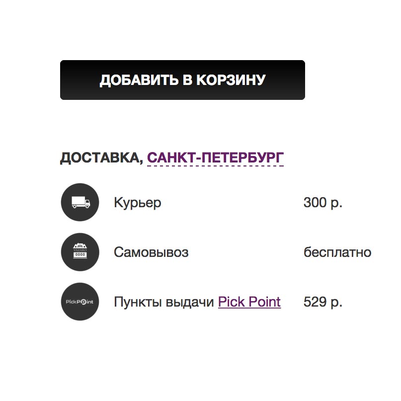
Delivery and payments
- Bank cards
- E-money
- Delivery services
- Parcel stations
Integration
- Synchronization with WMS/CRM
- SMS notification
- Email service
- Yandex.Market
- Google Ecommerce
- Advertising campaigns automation system
Outcome
As a result, we created content-rich, ergonomic, and fast eCommerce platform with the user-friendly structure.
Orders amount increase
average purchase amount rise
conversion rate growth among female visitors
