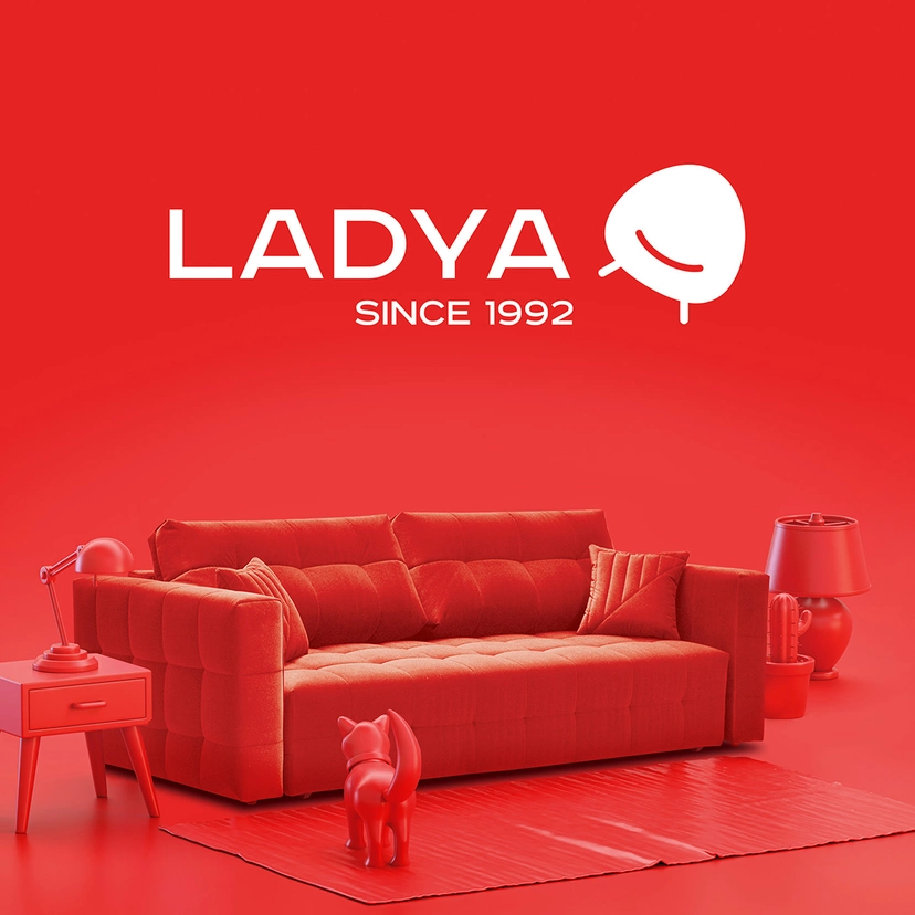
Ladya
rebranding a furniture factory: from heritage to modernity
Ladya is one of Russia’s oldest and best-known furniture factories, founded in 1992. We were asked to relaunch the brand, make it more relevant and contemporary, and reflect its history at the same time. We developed a new visual identity and showroom design for Ladya.
Challenge
Since 1992, Ladya, as a furniture brand, has stood for reliable home interior pieces, affordable to a wide audience. Over time, that audience has become more demanding of design and aesthetics. The old brand identity was associated with old-fashioned interiors. The new strategy of Ladya is based on renewed product lines meeting the needs of a younger audience.
We were asked to create a new, bright, and memorable brand identity associated with a European brand producing designer furniture.
This case study includes project images: interface screens, visual materials, and examples of implemented solutions.
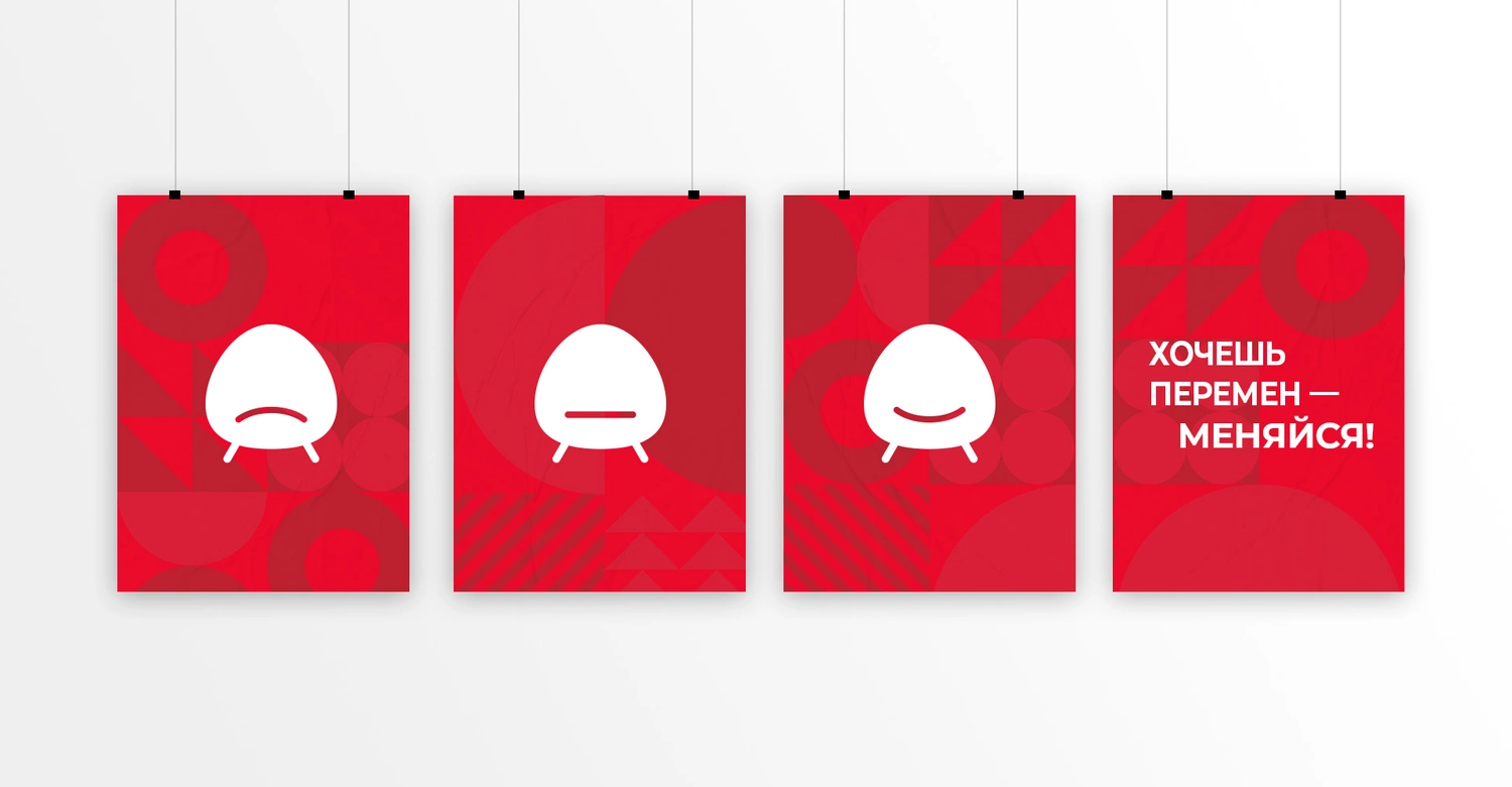
The logo: evovlution vs revolution
First, Ladya needed a new logo. Teamed up with the client's team, we reviewed all the factors of the rebranding: business challenges, risk to become less recognisable for the existing audience, costs of showrooms rebranding. We offered two approaches: evolution and revolution. First one, when with small changes we modify the existing logo in two stages to the final result, bearing in mind that it preserves continuity with the old logo as much as possible. The second is revolutionary, when we fundamentally change everything.
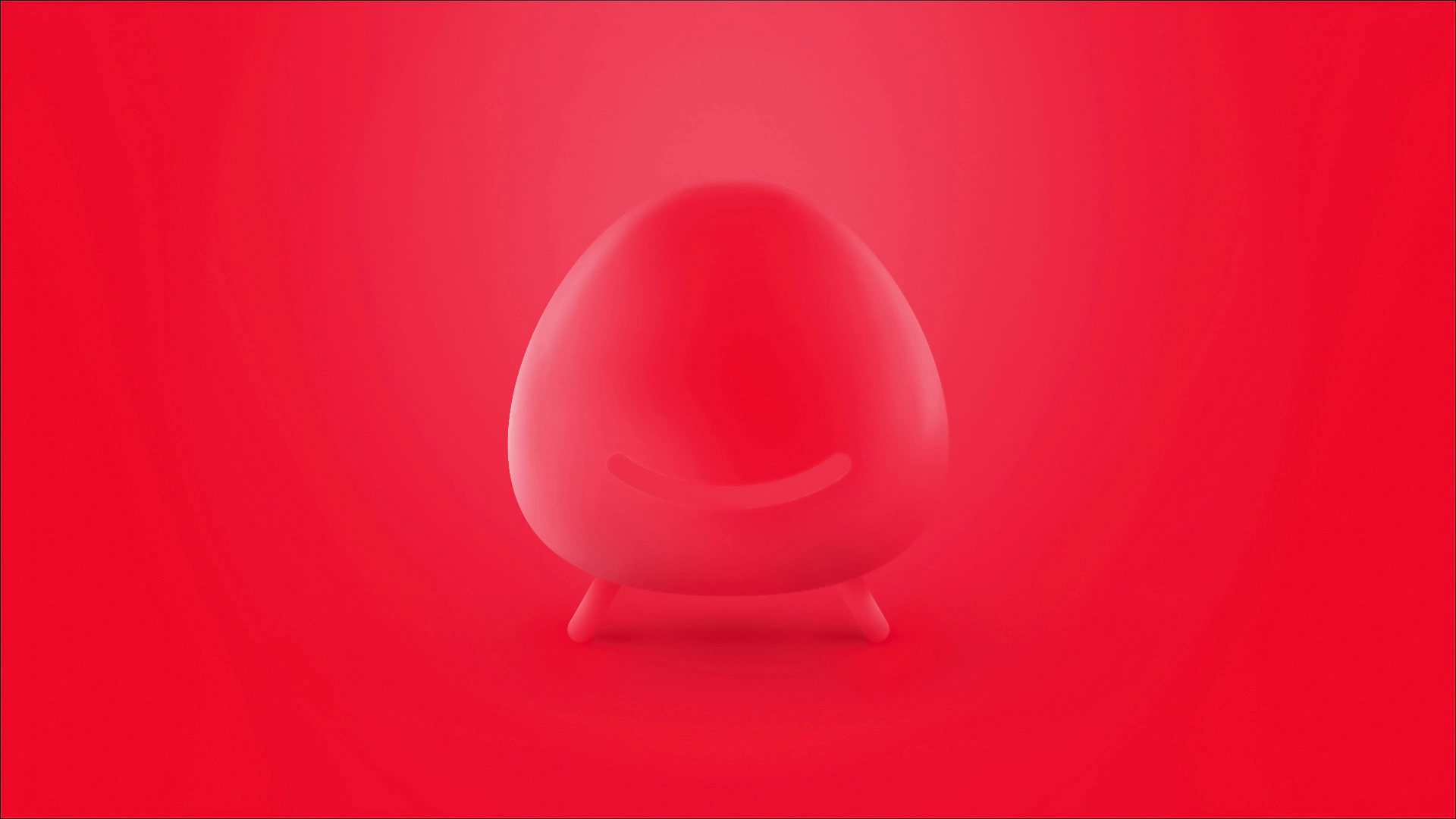
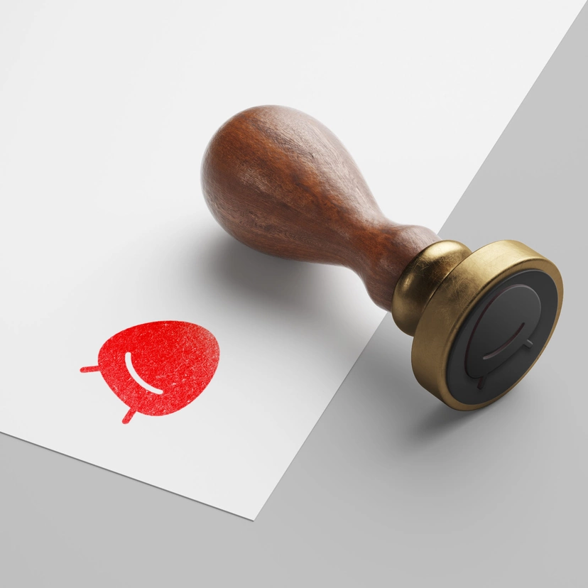
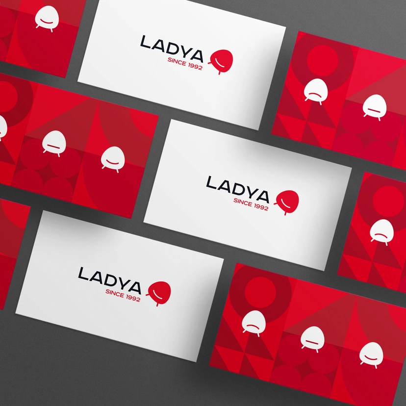
Our idea was to move away from the search of visual association with a word "LADYA": the rook, the home or the ship. Instead, we offered the clear visual message, the mathematic equation "LADYA = furniture". After numbers of iterations, we proposed the idea of a symbol in the form of a smiling chair. The minimalistic symbol gave us great potential for development.
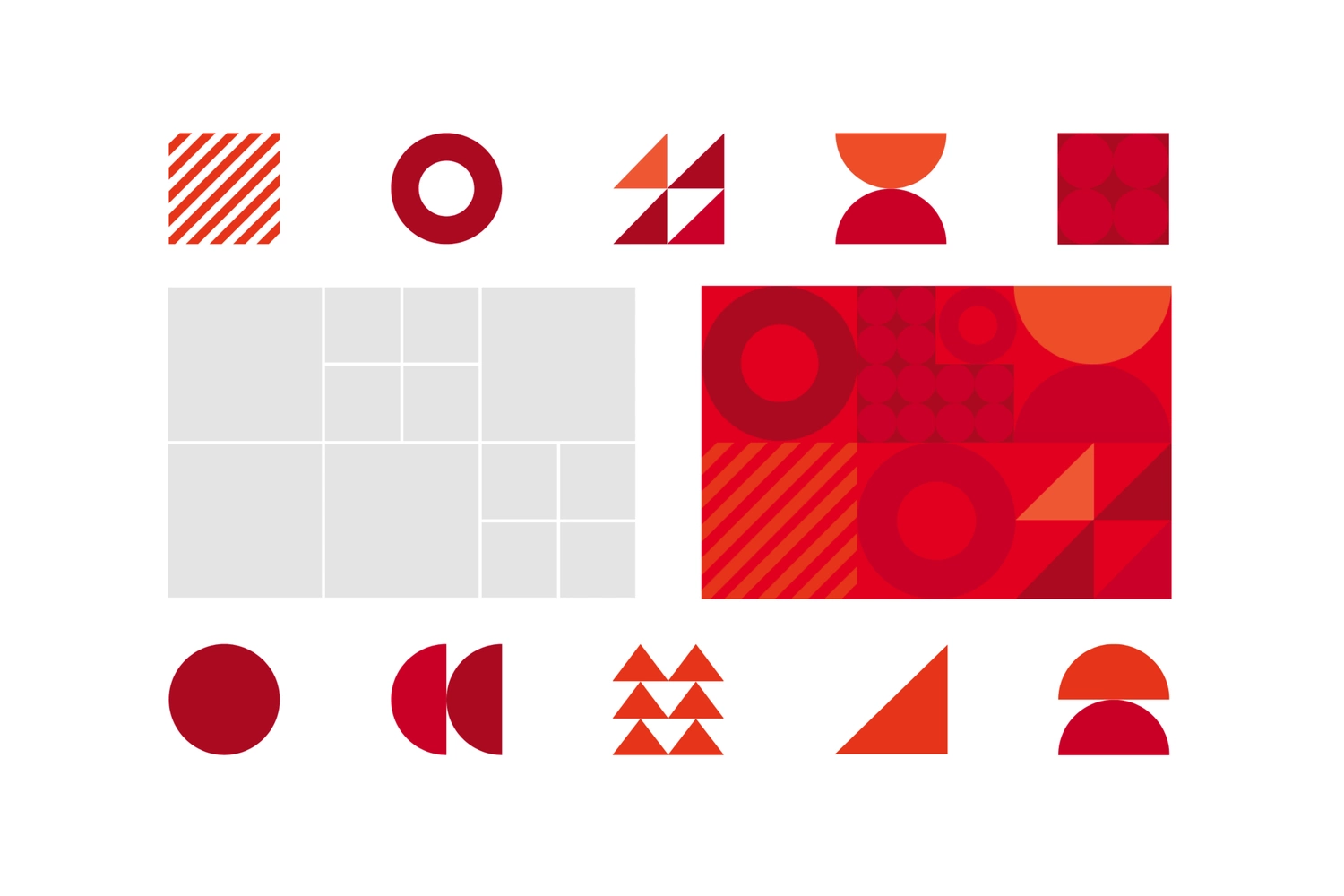
Brand identity
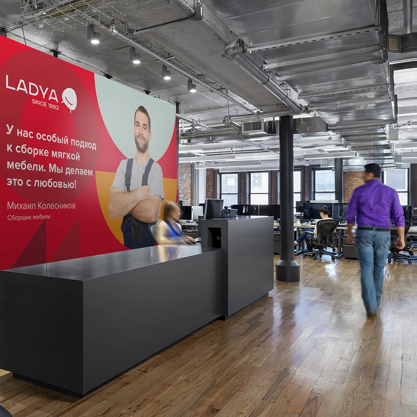
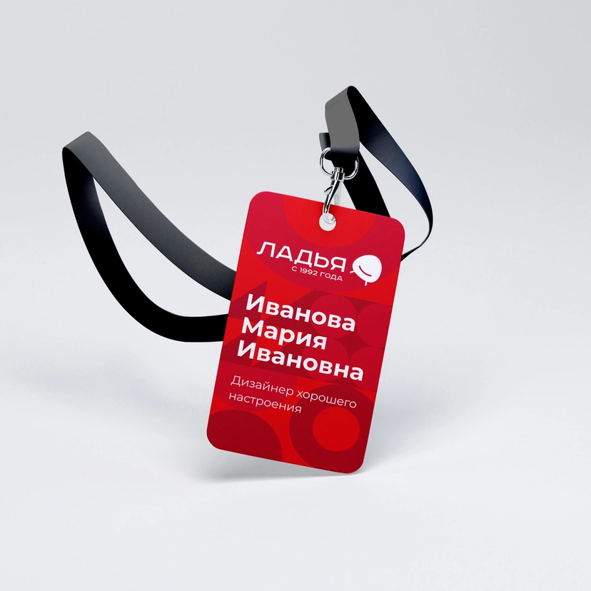
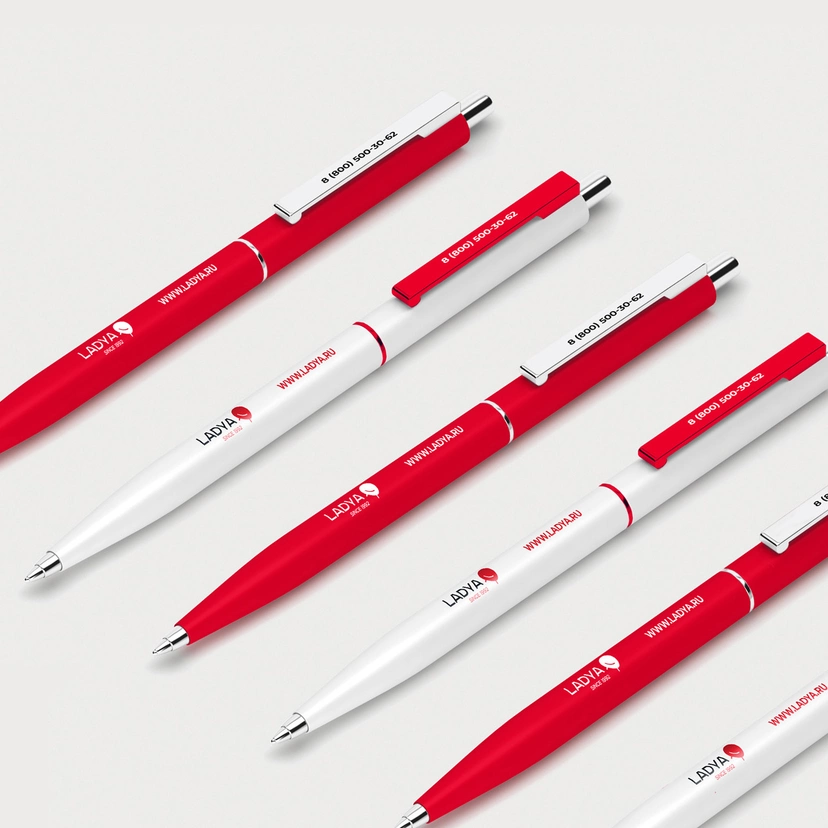
The created logo gave us the basis for the development of the brand identity. The concept of patterns based on the principle of developing background areas into squares and filling them with geometric elements was inspired by suprematism. We have designed the branded elements: badges, price tags, clothing, transport, and calendars.
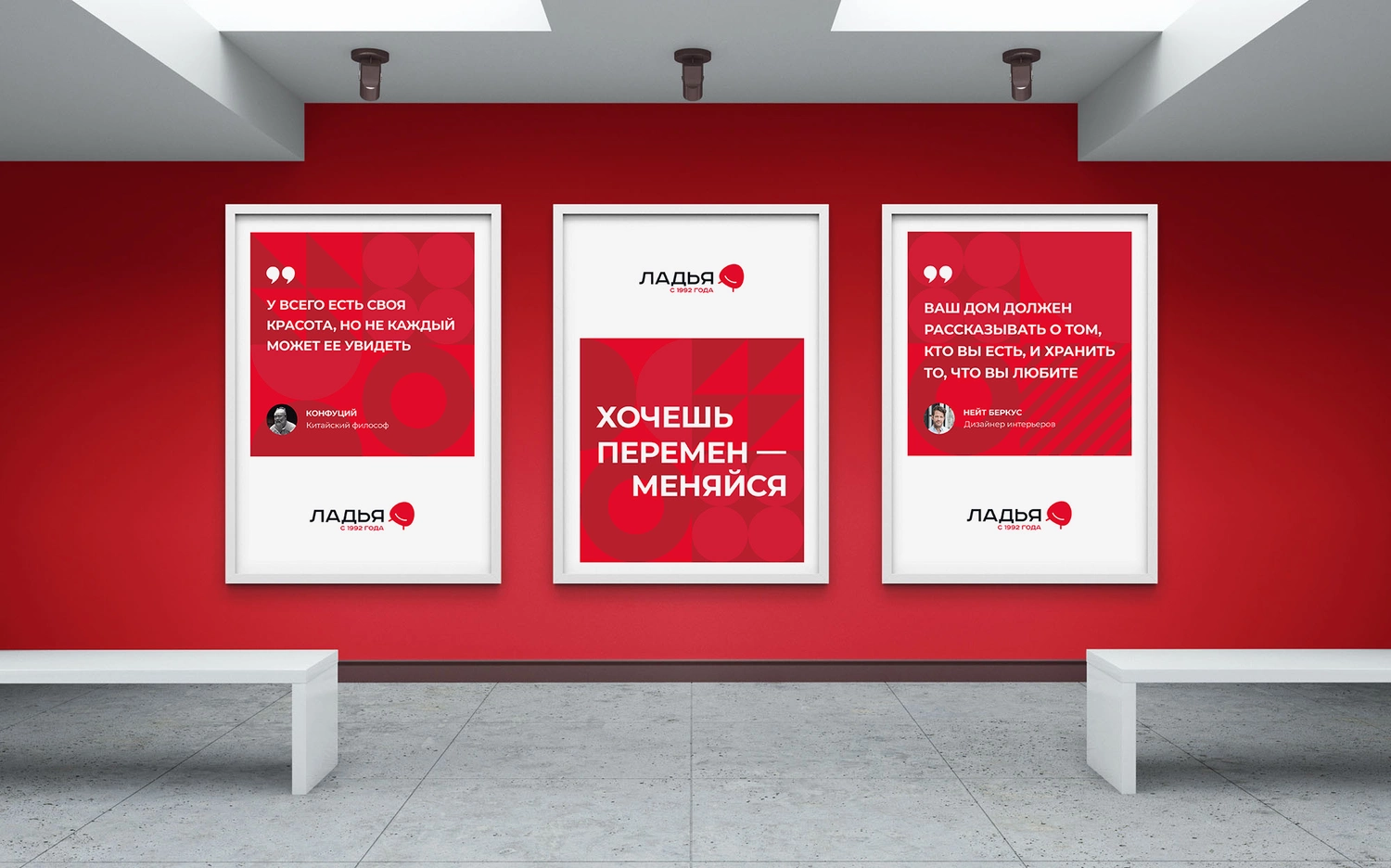
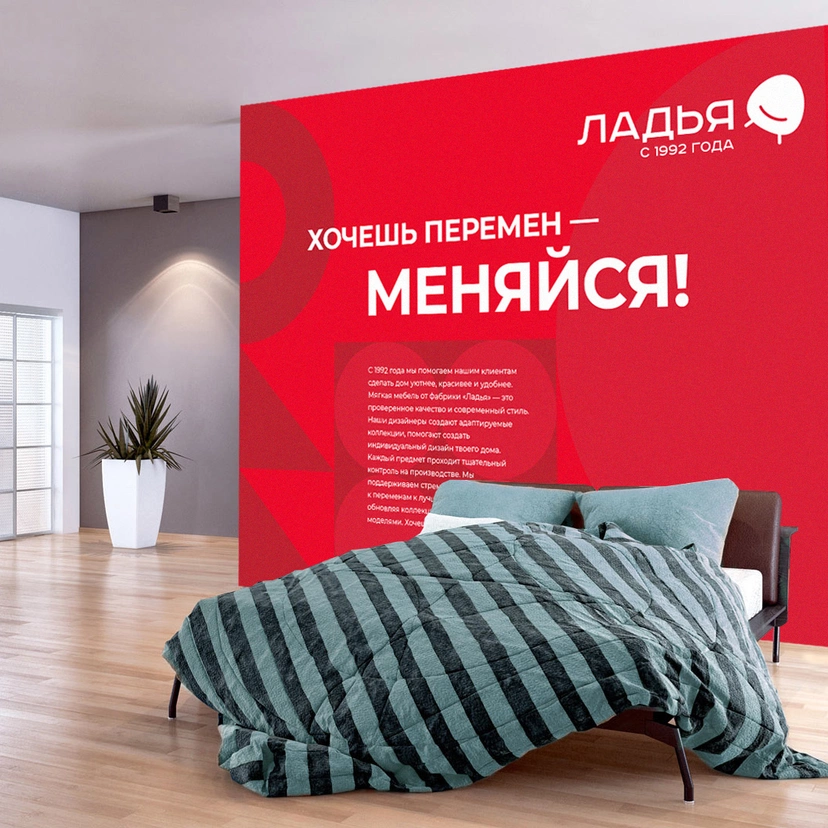
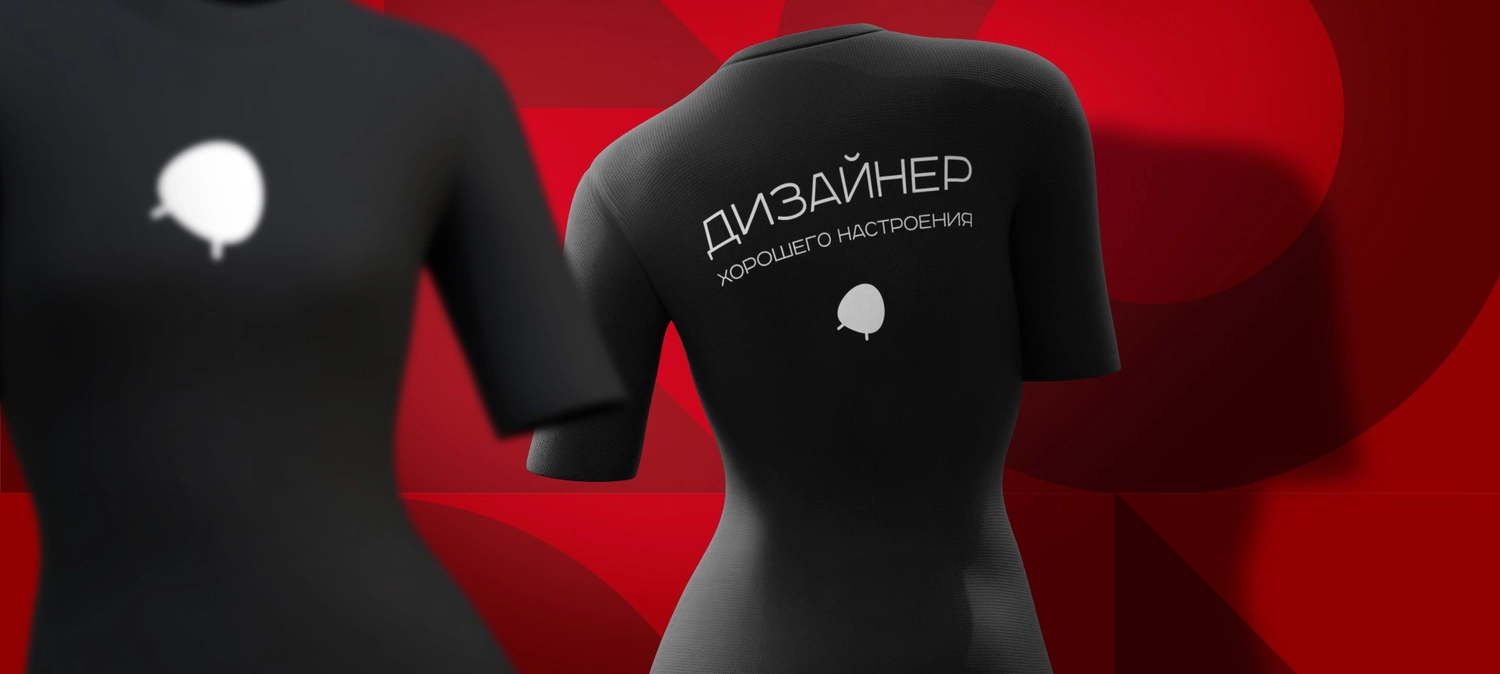
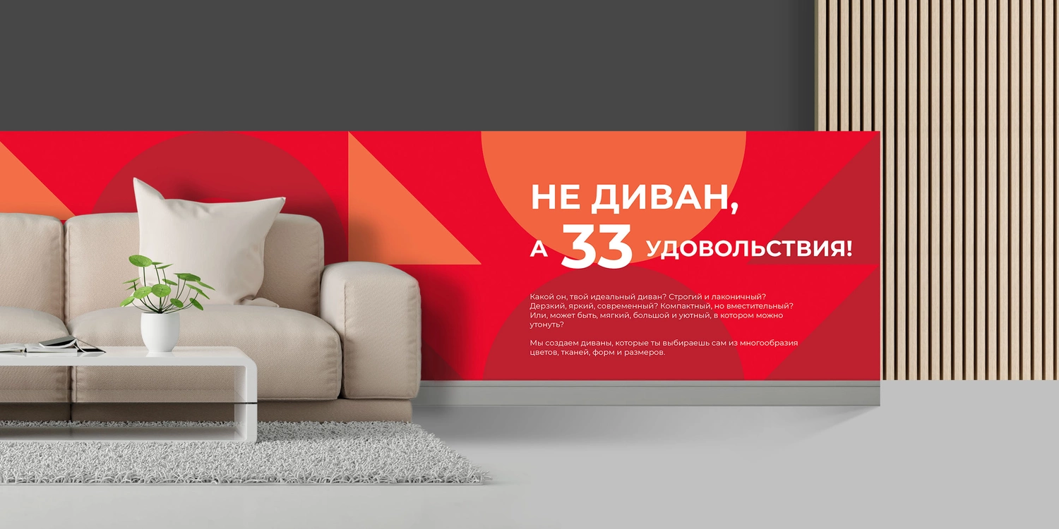
According to our idea, the brand should sounds light and relevant to customer needs, which is how these phrases were born:
- Not a sofa, but 33 pleasures;
- Designer of good mood.
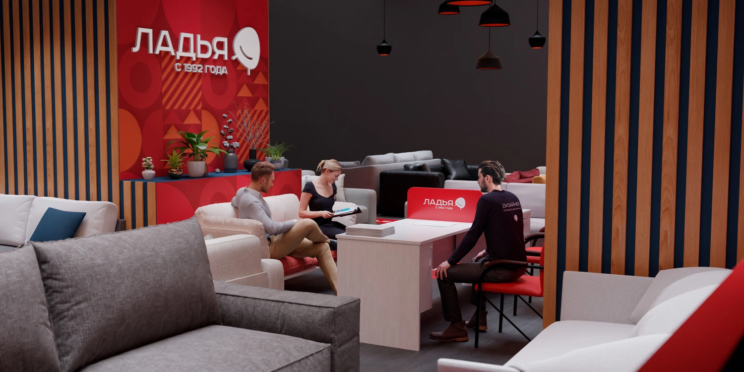
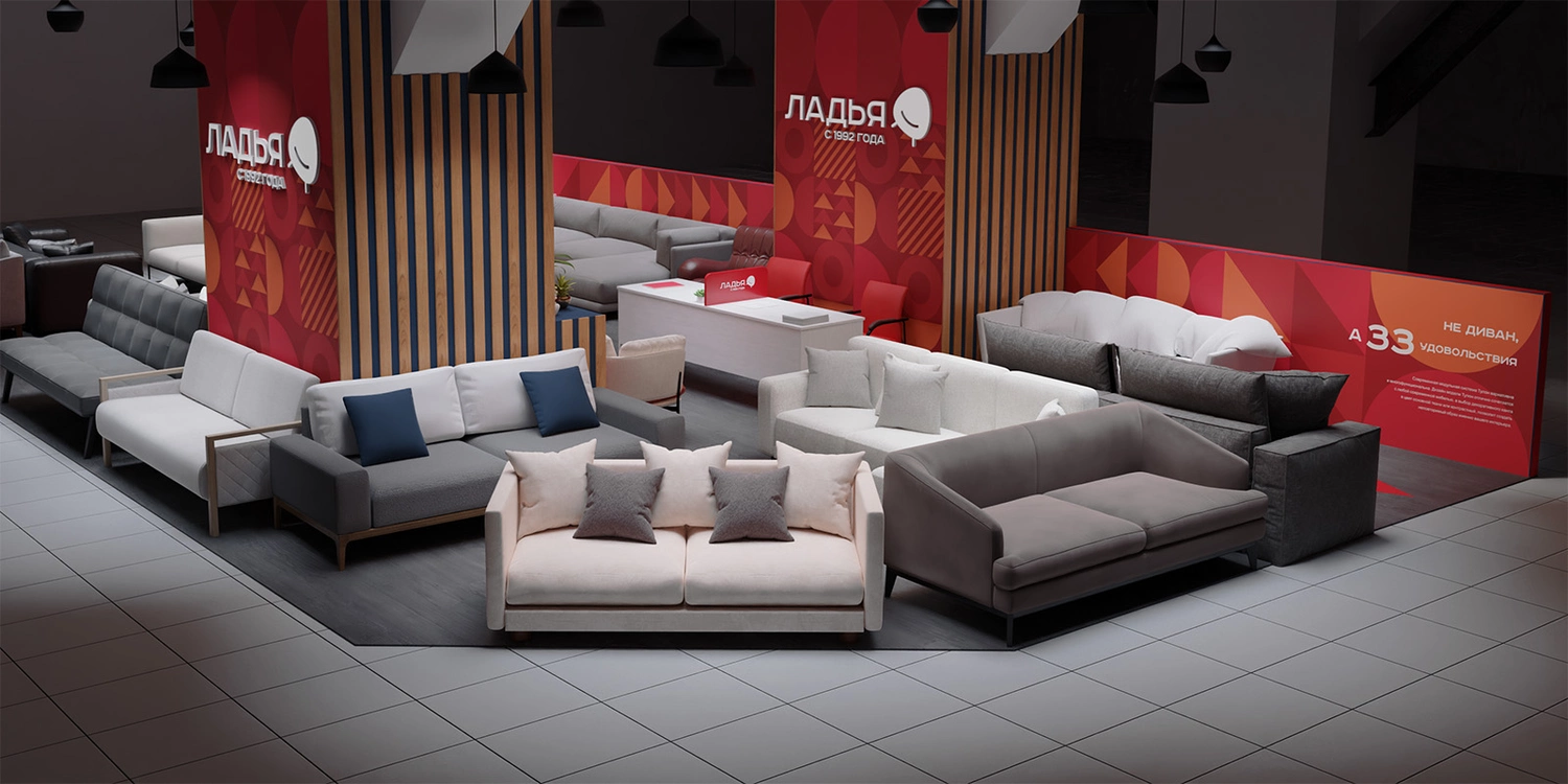
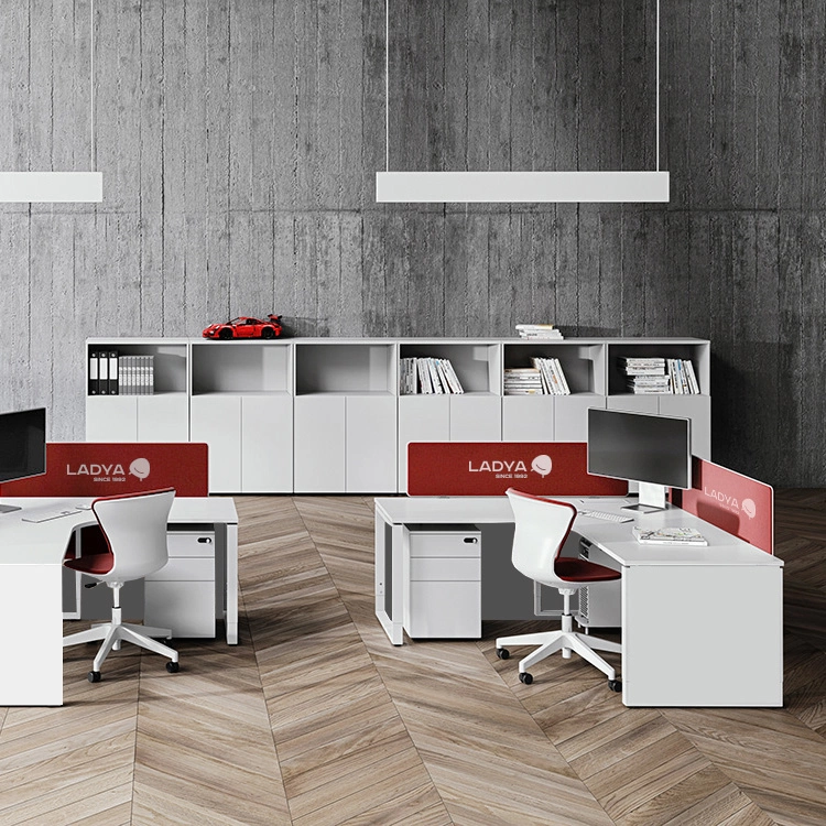
Showroom interior design
We developed the design for the showrooms of LADYA and performed their 2d and 3d visualization.
As a basis, the space of one of the flagship stores in Moscow was used. We studied the features of the space, its environment and the limitations on the structures that could be used in the shopping mall.