“Obivochka” is the leading professional furniture and upholstery restoration service in Moscow. We have developed a brand new website, meeting the needs of today's audience while focusing brand individuality and the company's market leadership, which always has to be a step ahead.
Background
As time passes, any couch or chair will lose its appearance.Upholstery gets damaged, a mechanism wears out. “Obivochka” lends a hand and offers a wide range of services: from partial repairs to complete, scrupulous restoration of furniture. The company has its own workshops, patterns of the most popular furniture on the market, and can recreate any furniture model from any initial state.
The service of hauling and repairing furniture consists of many aspects that affect the final price. At the same time, the market is saturated with competitors.
This state of affairs has led to the fact that on the Internet, different companies announce pretty low prices far below the final cost, which confuses buyers and scares away the owners of valuable furniture.
Our intention was not just to create a new website, but to analyze customers' needs and behaviour, and offer “Obivochka” a new approach to the presentation and sale of services.
Awards & Recognition
Furniture and Interior: Bronze
Honorable mention
Mobile Excellence
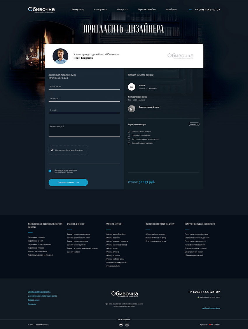
We asked ourselves while working on the project: how to make the first interaction with the client impressive, fast and, at the same time, informative enough that he immediately gets surprised and engaged. Which triggers let the client makes a call or a booking of a designer’s visit.
Insight
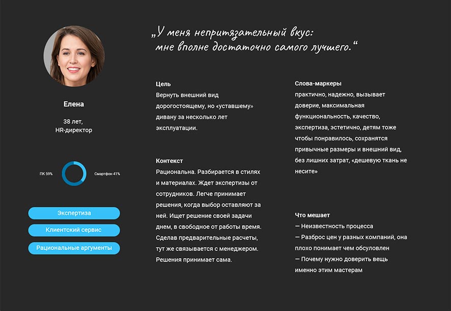
Fortunately, the artisans and designers of “Obivochka” are authentic enthusiasts of their work and, remarkably, also excellent salespeople: we spent two weeks discussing and systematising facts about real customers, typical questions, and studied what stops and what helps customers make a choice.
We identified five audiences of customers with essential differences in behaviour, determined pathways for them on the website that meet their needs and, based on this, designed the structure of the new site and its functionality.


First look
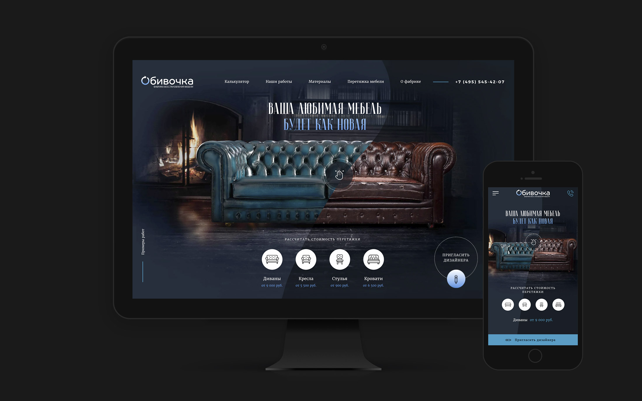
We paid particular attention to the first screen that the user sees. It performs two functions: it explicitly shows what kind of service and price tag to expect and creates a wow effect that engages the user in interacting with the website.
We use the image of the classic leather couch with the “liquid border” effect, which allows the user to transform the couch between ruined (before) and restored (after) state.
Brand perception
Unlike the old website, we brought personality and openness to the new one. A customer trusts his expensive and sometimes unique furniture to specific people he has never met before. Our goal was to introduce the artisans to the customer, their experience and passion for crafting furniture. Therefore, the service, work, and features are explained by quotes from the leading artisans and designers on the new website.
Showcase of work
Nothing can explain the company's approach and expertise better to the client than the stories of the work performed. We introduce the client to the process and the results in advance:
- We tell the story of furniture, and the reasons and features of repair;
- We describe working methods and technologies;
- We show a gallery of before-and-after photos.


Cost estimation
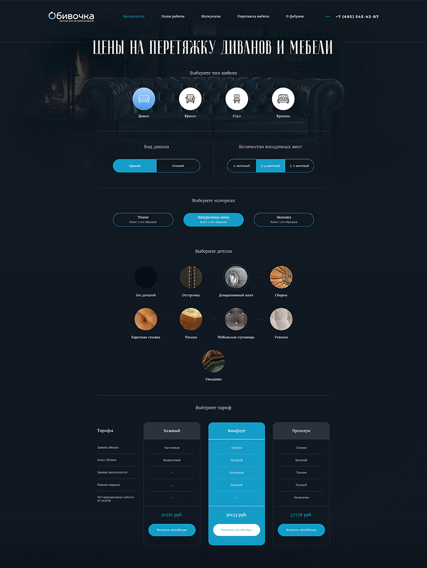
The new price calculator should estimate the cost of repairs as close to the final price as possible, so as not to mislead the buyer. However, depending on the renovation's details, the price for the same piece of furniture can vary enormously.
Besides, we have found that many buyers prefer not to receive one fixed price, but choose from several options independently.
Taking this into account, we have changed the structure of the service cost calculator. We removed the options that have little impact on the total price and added a choice for customer between service packages, each describing different repair options and explaining the price difference.
This approach allowed us to show the client the most accurate estimate of the actual cost of repairs.
Upholstery catalogue
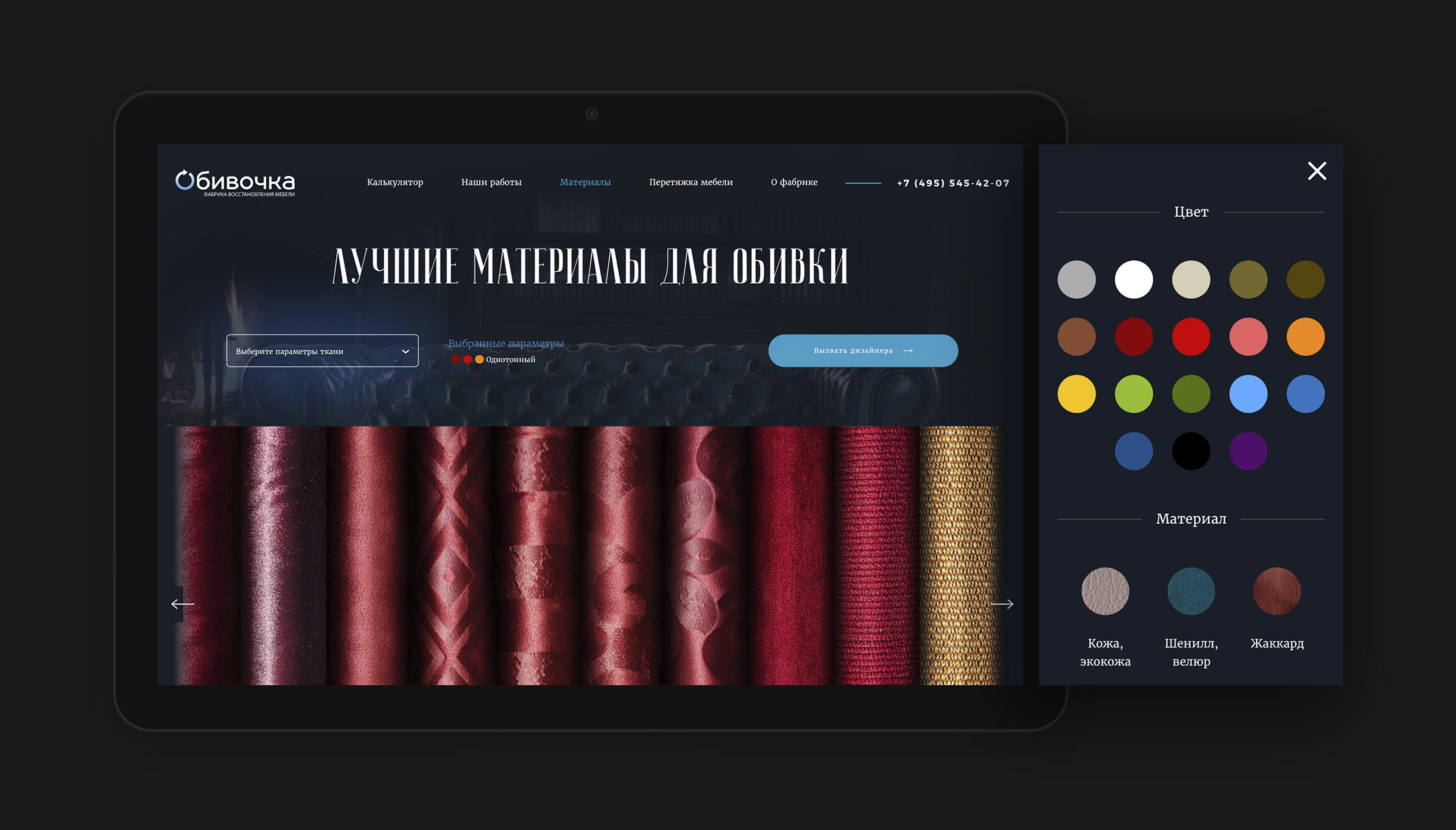
The choice of upholstery is one of the most important steps of the customer’s journey, as customers often start their journey by choosing suitable upholstery. The website has an upholstery catalogue where customers can filter options by type, color and pattern. Keeping in mind that thousands of items make choosing too difficult, we intended this section to give a general idea of what options are available and, most importantly, book a free consultation with a designer who can advise the best choices.
Mobile experience
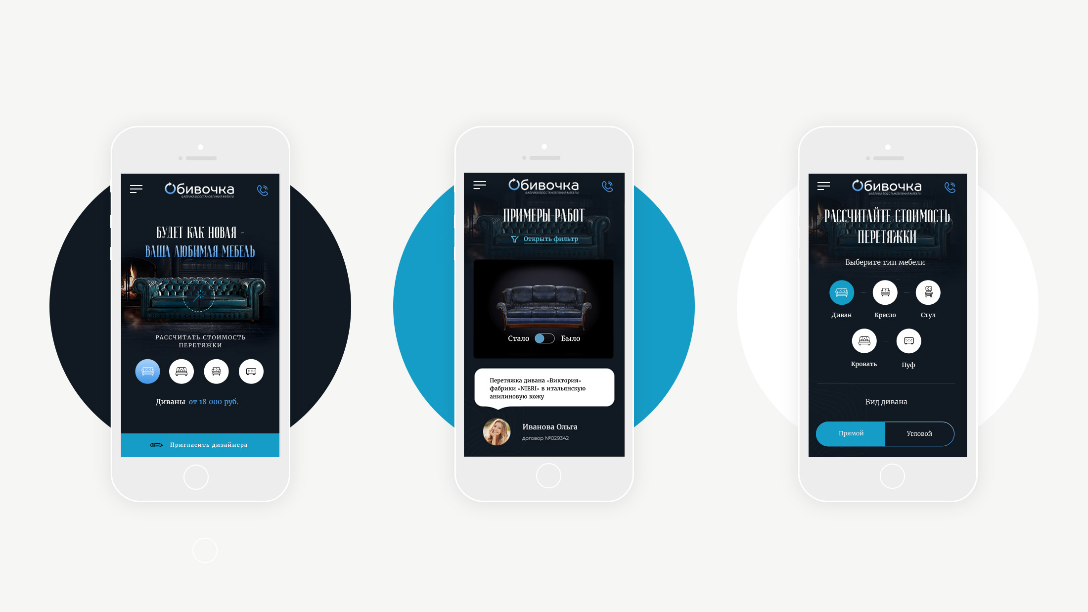
It's no secret that most customers access a website from a smartphone, so we have provided easy navigation and feedback methods. The mobile version completely replicates the functionality of the desktop version without restrictions. We took care to optimize the loading speed of the website, balancing between site performance and visual effects.
Features
- Wow-effect idea and frontend development
- Responsive design without restrictions on mobiles
- Customized Bitrix CMS platform
- A flexible and SEO-friendly structure
- Structured metadata
- SMS service integration
- Google Analytics and Yandex Metrika
- Fast and high-performance user interface
Outcome
Website figures after half a year.
Increased engagement of users to the sale funnel
Decreased bounce rate
Increased conversion of the mobile version
