MesserMeister is a new and exciting hardcore online accessories store for men.
Goal
MesserMeister is the oldest retail network selling knives and knife accessories. Our goal was to breathe new life into the existing eCommerce platform and change the brand recognition so that the retailer could broaden the range of products while also retaining brand identity.
The new MesserMeister is a store of various masculine items, primarily knives, crossbows, air weapons and a broad assortment of recreational goods.
Deliverables
e-commerce web front-end integration strategy ux seo content copywriting promo smm
Release date
01.12.2014
view case
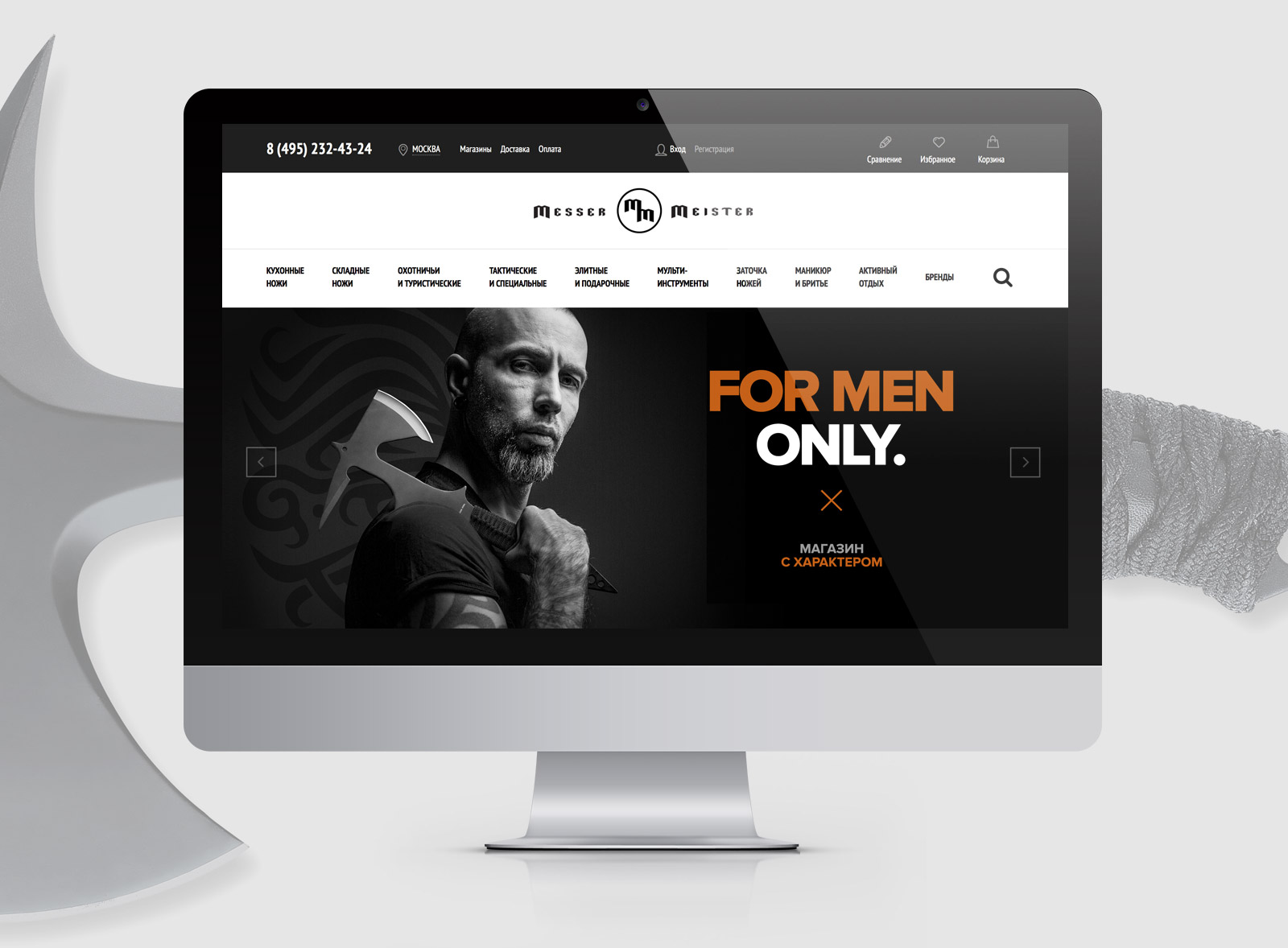
The website was created for two main audience groups: experienced knife connoisseurs who are already familiar with knife manufacturers and technology, and amateurs that who mainly interested in product usage and its aesthetic appeal.
Solution
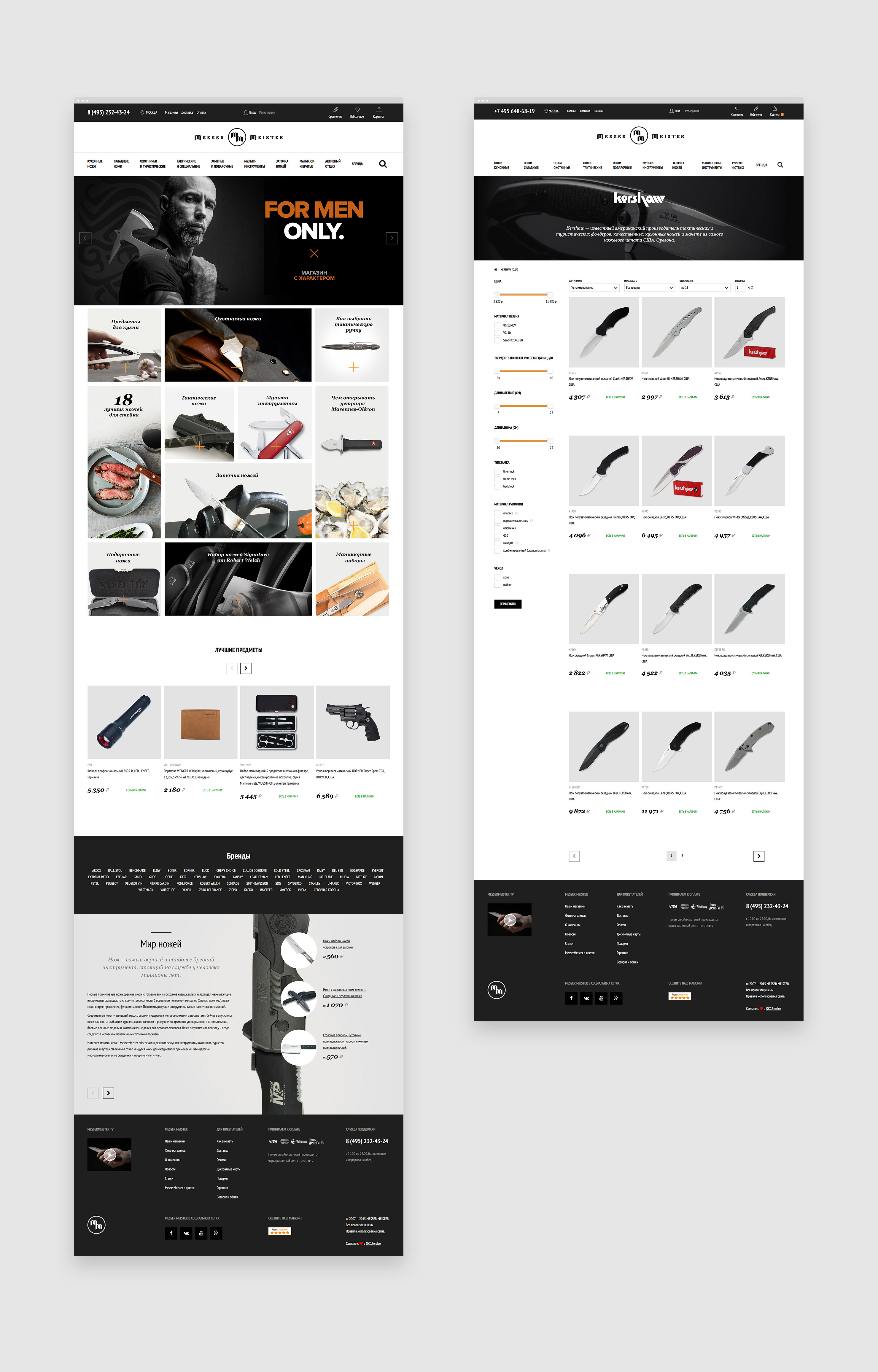
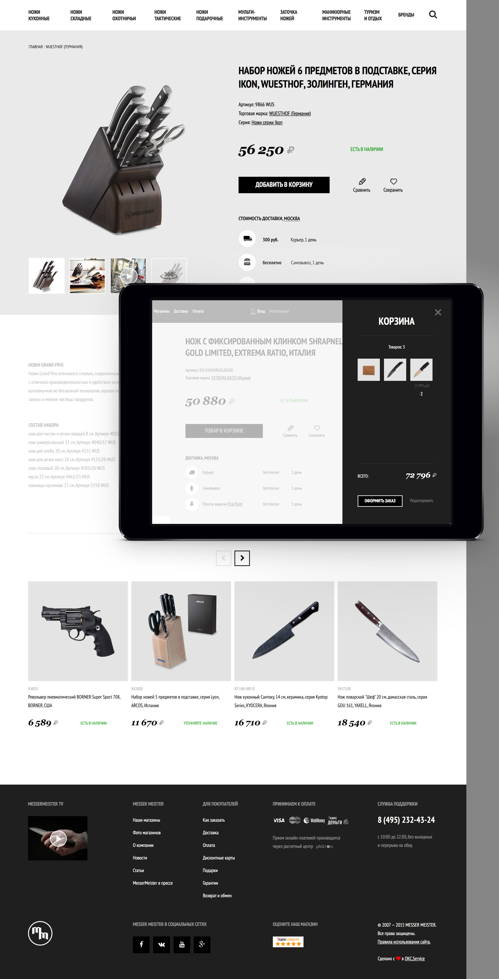
We created a new design for the eCommerce platform, focusing on building an easy customer journey from the entry page to making an order. At every step the store should help and inspire the user to discover products that may be of interest to him, analyzing his activities on the website.
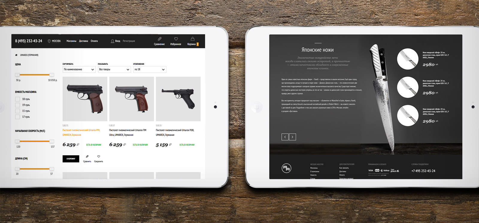
The Messer Meister eCommerce platform was based on actual UX research studies and has been made available for desktops and tablets, including those with retina displays.
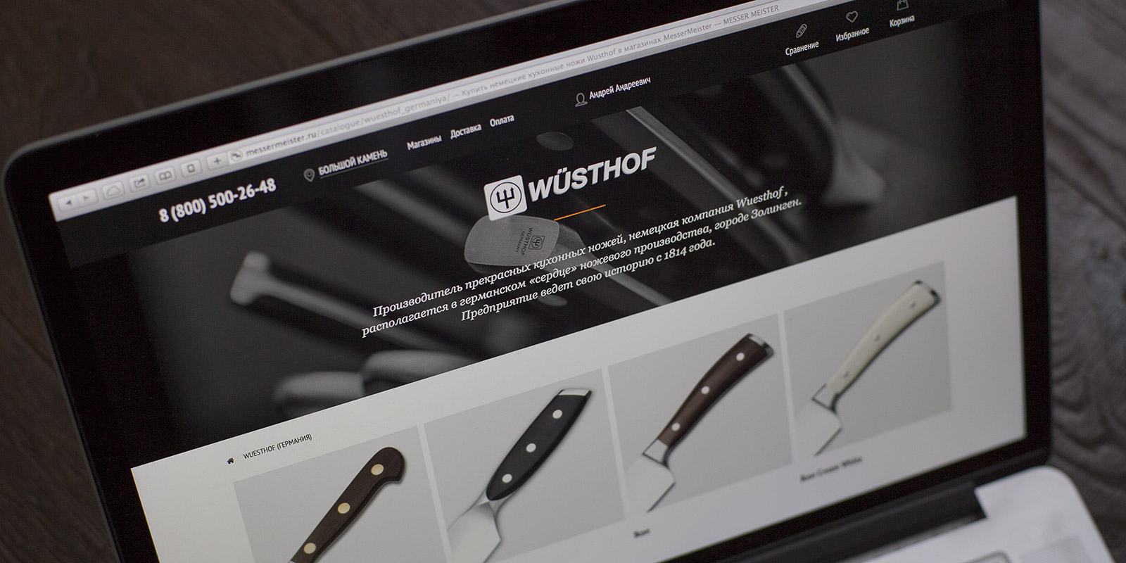
User experience is all about balance between simplicity and function. That is why we gave special attention to UX design and usability tests.
We implemented several methods to enhance user experience:
- Fixed menu with the most used elements: the phone number, shopping cart, and tools that assist in making a purchase.
- We cleared the page of distracting elements to focus the user’s attention on the chosen product.
- Interface “lightness” by ensuring a fast load of basic elements, with lazy loading of secondary ones. We used the space to build the visual hierarchy.
We created product pages containing detailed information and suitable item choices. This helped us lower the bounce rate considerably. For instance, the catalogue bounce rate decreased by 30 percent.
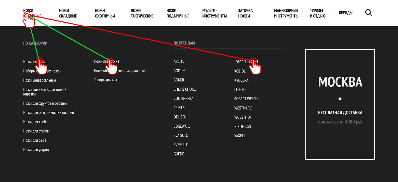
The unique mechanism of the drop-down menu gives the website an edge. As a rule, when the cursor trajectory intersects the nearest menu item, the drop-down menu shifts to another tab.
Here we used technology that distinguishes between different trajectories and decides whether to switch to another tab or not.
Frontend
The front-end was built using RequireJS + Less/CSS module technology that not only shortened the development time to 25 days, but also increased the website performance. We optimized the following aspects:
- The number of HTTP requests;
- Image smart caching;
- Creation of a separate cache for retina-images;
- CSS and Javascript files minimization.
SEO
The catalogue allows for the creation of landing pages to support eCommerce platform promotion efforts. As always, we took care of both internal optimization and the utility of all SEO elements, first for the user and then for the search engine.
faster page load
decreased the size of the page
fast frontend development
Backend
The eCommerce platform receives data on the warehouse management system. The massive scope of information recieved and the possibility of outdated data being uploaded called for a reconsideration of how the website interacts with this system.
We apply three methods of interaction:
- Total synchronization of catalogue data: all images, related files, and product characteristics;
- Quick synchronization when only prices and stock availability need to be checked;
- API for order processing.
The website can operate offline as well as in synchronization with WMS. This allows the platform to keep running regardless of WMS availability.
Outcome
Increase in the eCommerce platform figures after redesigning.
less bounce rate for the cart
Growth of the average order value
Growth in the orders amount