What if a customer’s digital experience will beat the traditional way of buying furniture? We teamed up with the furniture factory “Divanchik” to set a new way of shopping for sofas and to create a successful sales funnel for a new product.
Background
The ”Divanchik” furniture factory is a new business, with the biggest factory for furniture restoration and with years of experience behind it. Indeed, they have been repairing sofas since the last century, and know how to create reliable and comfortable sofas that will be in high demand.
Our mission was to create not only the eСommerce platform and digital strategy to sell goods, but to reconsider and digitally transform the whole relationship with customers, to bring them an experience that exceeds their expectations, and to do it entirely in a digital environment.
Deliverables
ecommerce strategy web ux id integration content seo copywriting smm
Release date
11.09.2018
view case
Awards & Recognition
Best branded eCommerce: Silver
Honorable mention
Special Kudos
Best UI/UX
Best Innovation
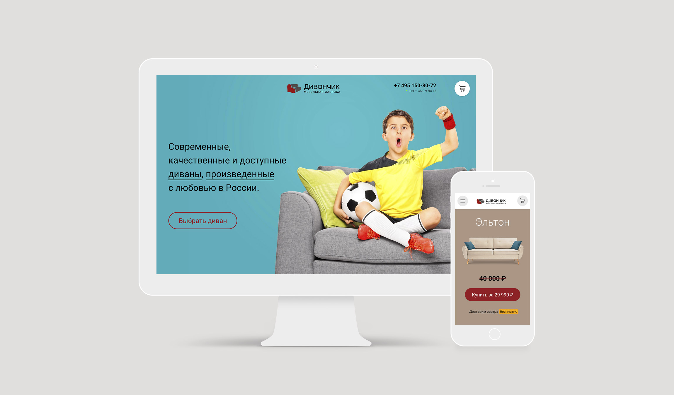
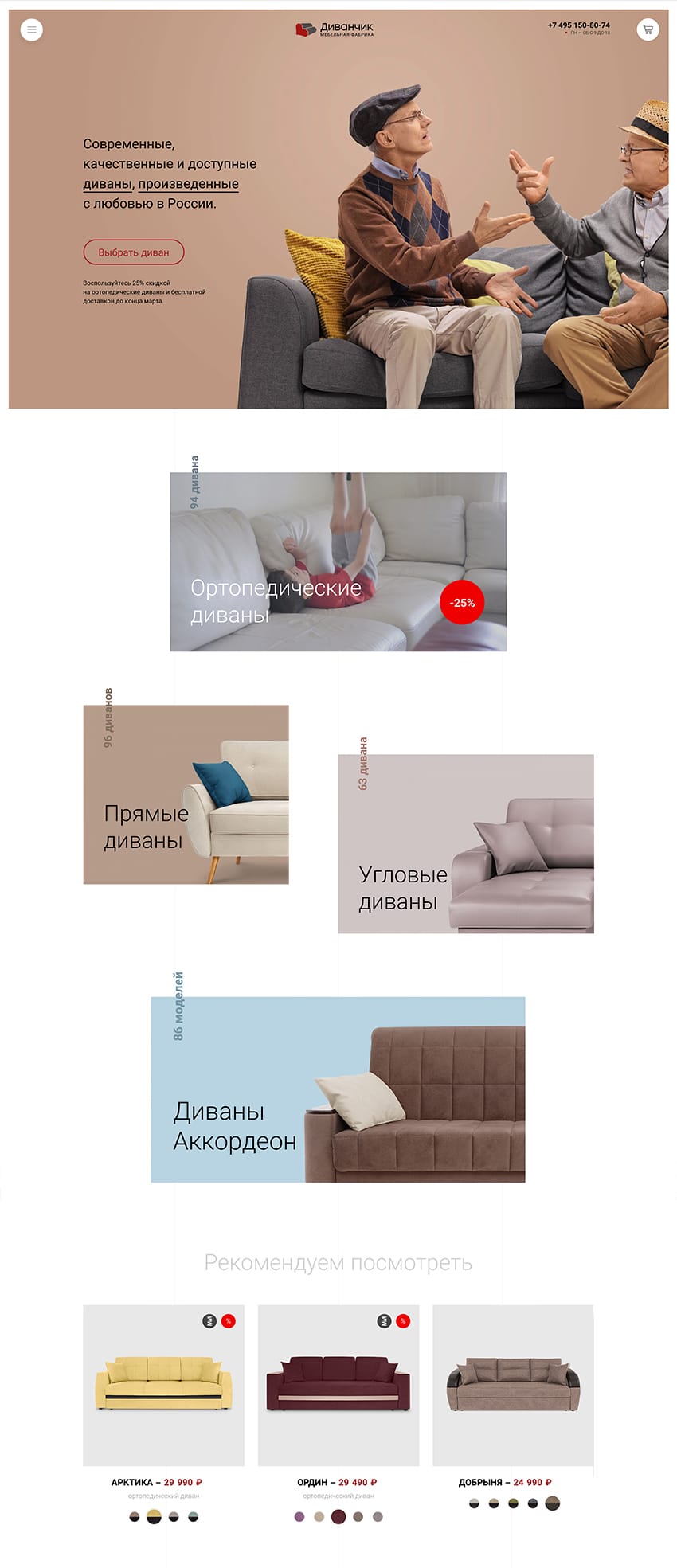
The sofa is not a piece of cake! It is an important buy, the thing that shows off and defines the style and character of the interior.
Insight
The appearance of the sofa is not the only thing that matters. Customers want to examine the comfort of the sofa, its tactile sensations, and its functions.
The audience we need to communicate with is quite wide, including millennial couples and Generation X with all their differences of perception.
At the same time, a comfortable purchase pathway and a reasonable price do make the difference that sells to all audiences.
We’ve used customers' digital experience as a basis for brand identity, when the perception of the brand and the product are fully determined in the digital environment.


Every single product shows the excellence in details that can be seen right away on the website.
The product and the digital strategy
Divanchik’s sofas have an affordable price and uncompromising quality.
We named each model of sofa after places showing Russian nature. Each sofa has its own legend and character, which reflects its advantage and origin: Baikal, Tihiy, and Angara. There is a deep cultural context within the brand’s message “Made in Russia with love”.
Our client offers us not only the perfect product to promote but a strong marketing opportunity: the sofa can be ordered without any prepayment and it will be delivered on the day following purchase.
With this idea in mind we created our digital strategy, customer journey maps, touchpoints, and campaign.
The customer experience
Just imagine a person on the way home from work and choosing a sofa on his smartphone. He orders a sofa, and tomorrow it is already brought to his home, without prepayment, and exactly as he chose on the site.
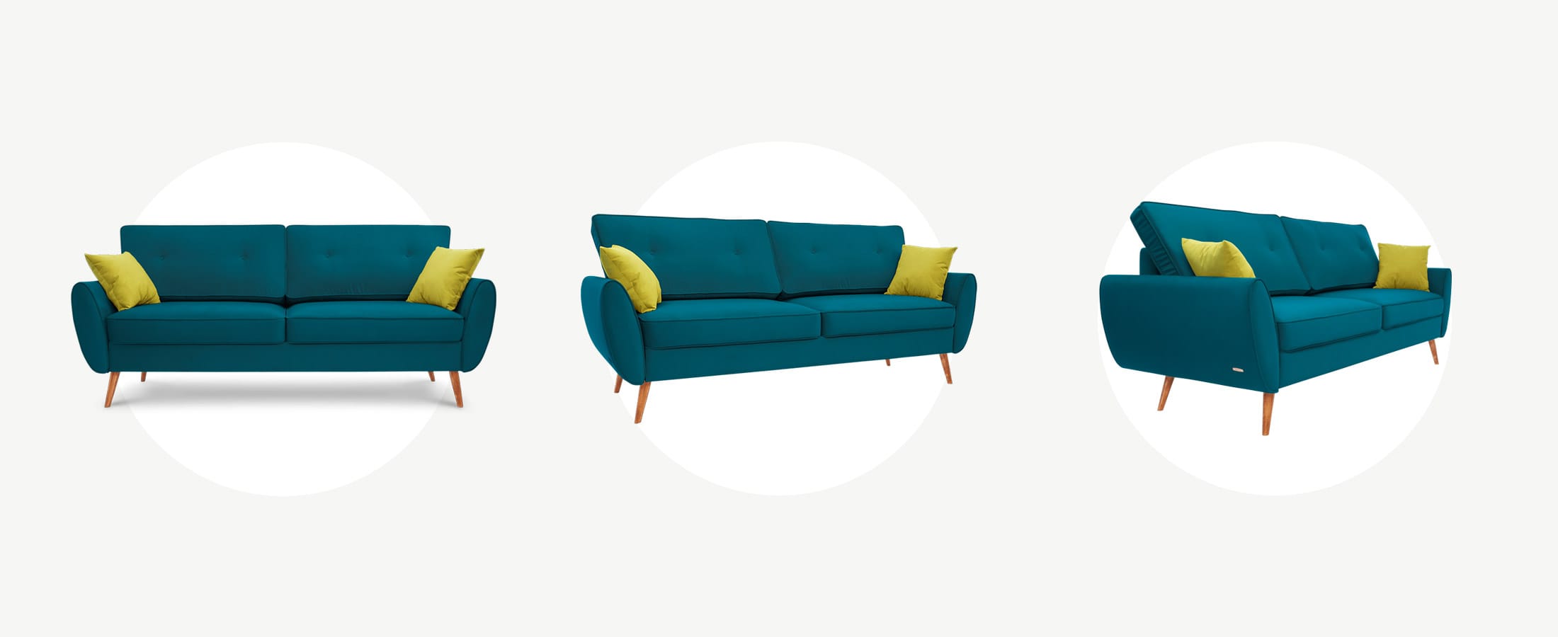
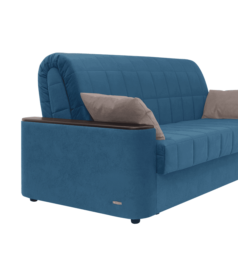
Every single product page is a microsite of the sofa, where a customer can get to know it perhaps better than in the showroom:
- to look at the sofa from all sides, rotating it in two planes;
- to choose a sofa with a shelf or with large storage space;
- to open and close the sofa;
- to discover how the orthopedic effect is achieved and what materials are used;
- to check whether the size of the sofa and bed space fit your requirements;
- to see fabric options and other, similar sofas.
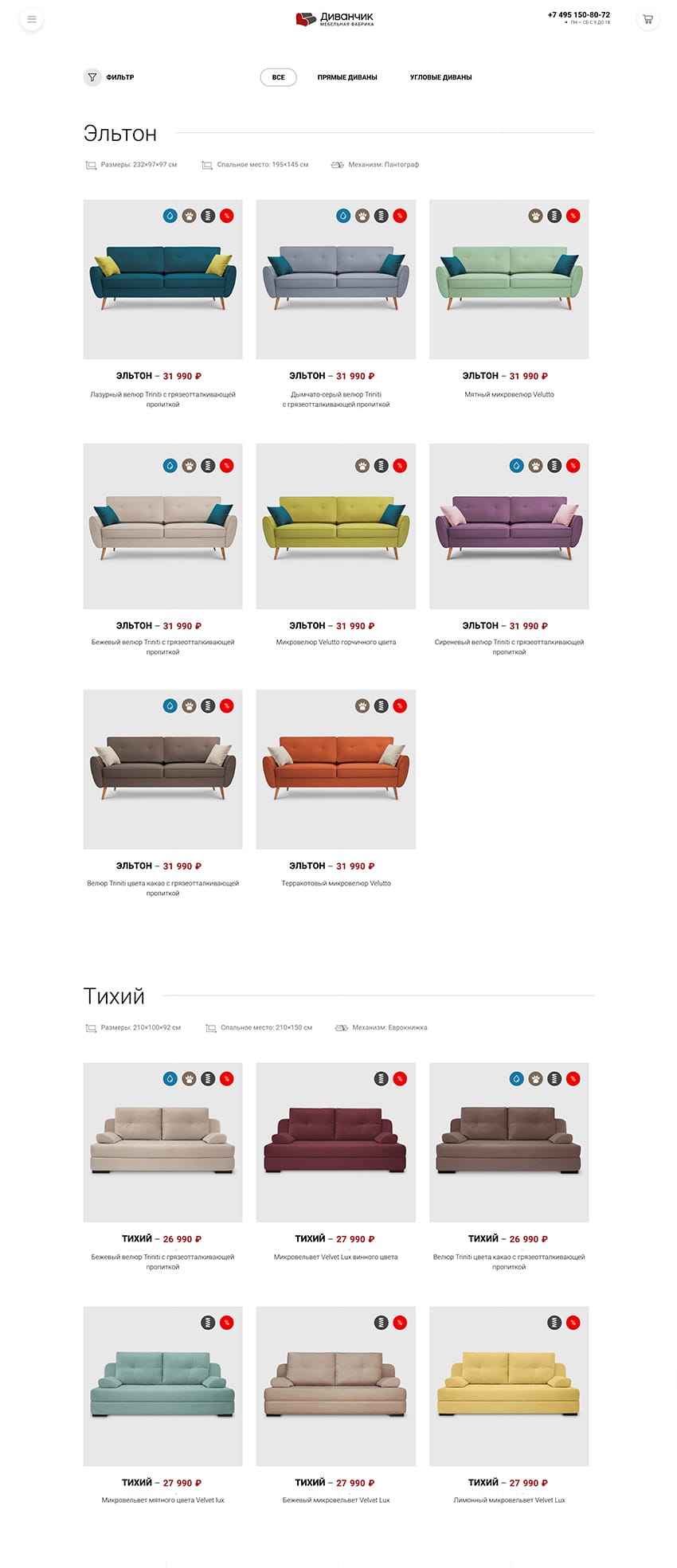
Every product page contains more than 200 images of the sofa, which are taken, retouched, and published with strict design rules.
All the sofa’s pictures are taken in a studio on a special turntable. Each shooting requires precise retouching with a predefined routine and time limits. We have such effort points as:
- full identity of color for the same fabric, but for different models;
- the real-life look of textures;
- the same points of shooting and lighting conditions;
- the optimal size of images for the required format and geometry.
We show the buyer authentic, “live” photos to be sure that their expectations and the real sofa are no different.
The key to the success of the eCommerce strategy is the path to purchase.

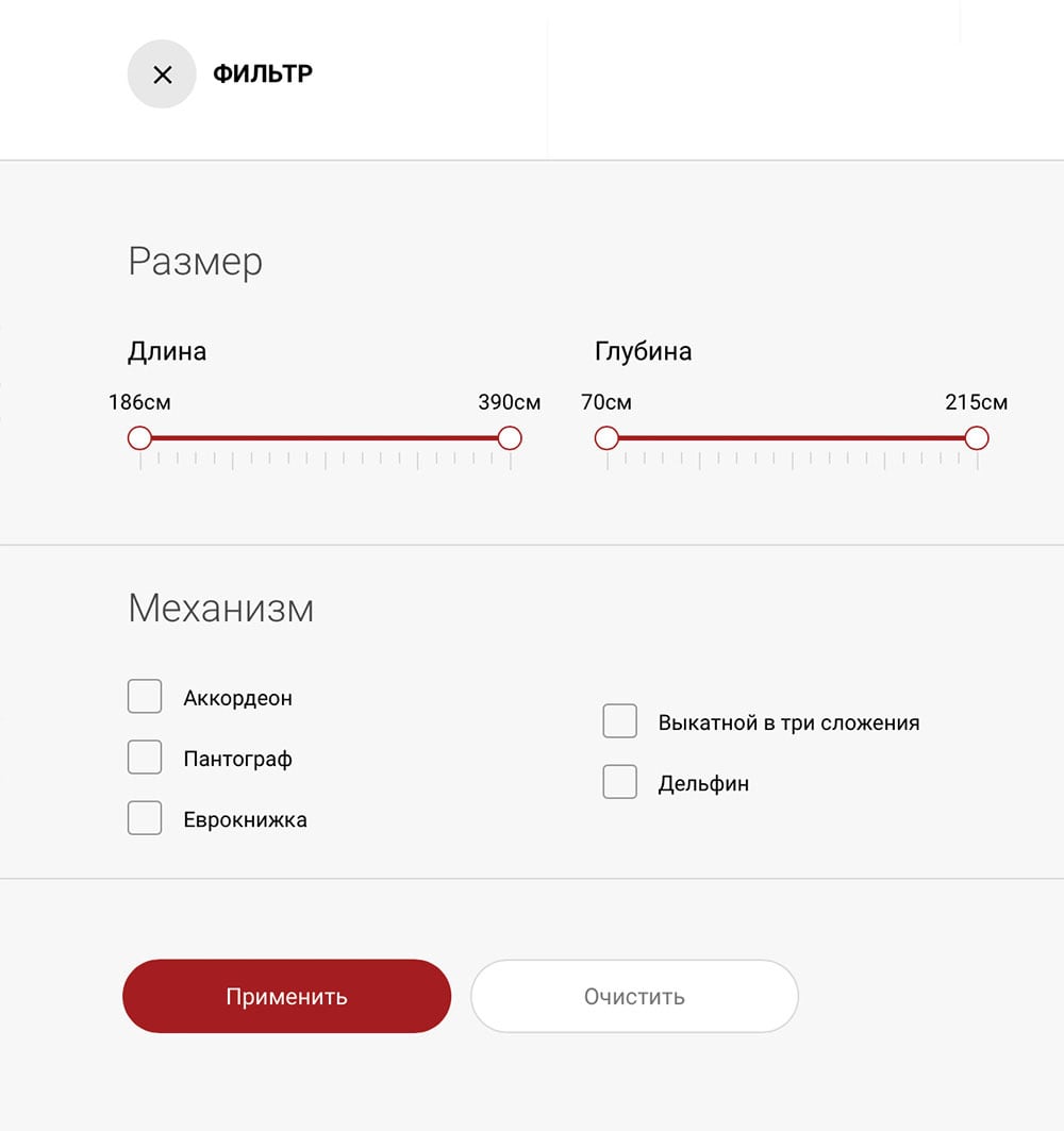
Navigation
The filter allows you to choose a sofa according to its desirable characteristics and to move quickly between popular sets, like "anatomical sofas", "loft-style sofas" or even "white leather sofas".
The path to purchase
Using audience segmentation we invented an intuitive flow for the user through the website interface with shortened paths to purchase. For instance, one of the tricks is to allow a user to choose a color in a product’s thumbnail, without needing to visit a detailed product page.
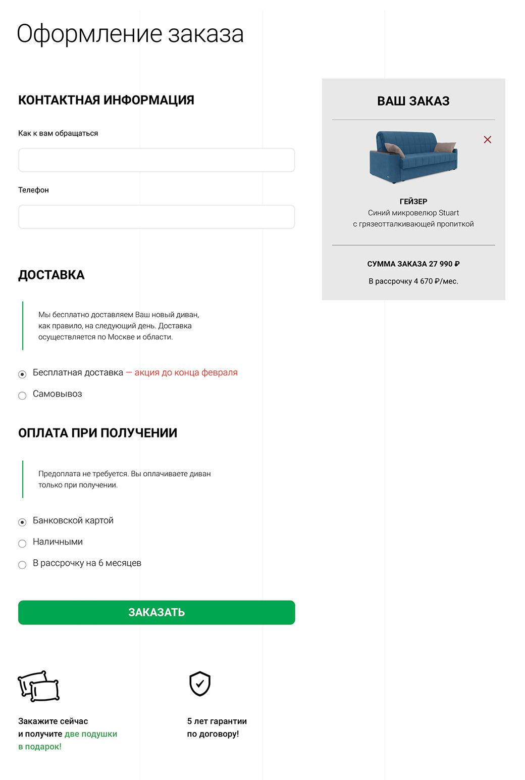
Easy to order
In 98% of cases customers prefer buying just a single sofa, and this fact helped us to increase the conversion rate by combining the basket and order submission form in one simplified page.
This order page is designed to be simple and completely comprehensible to the user, with only the information that is essential for helping the user to complete an order.
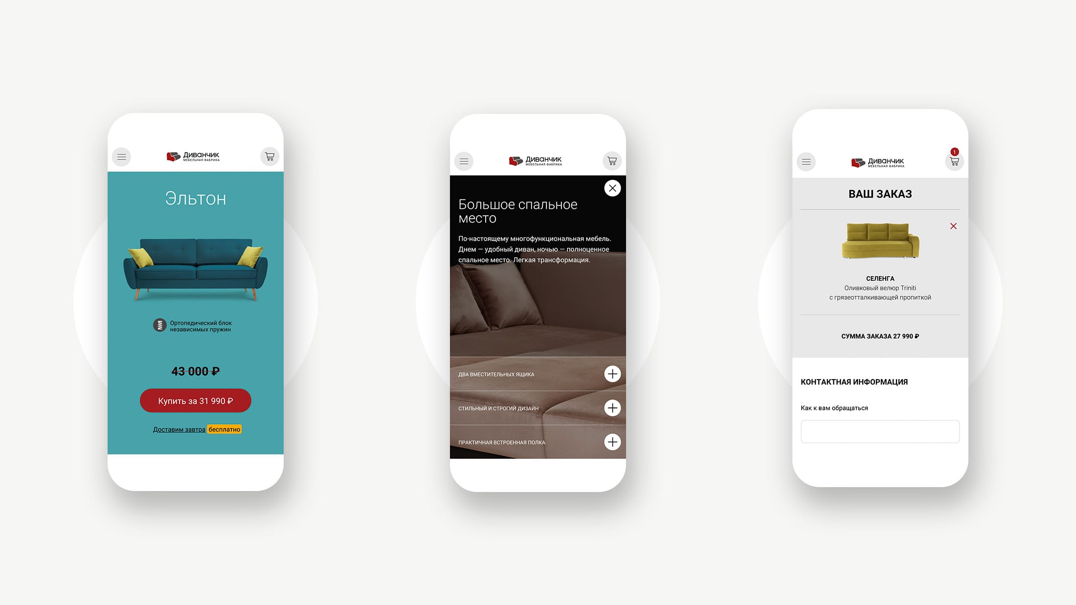
More than 60% customers of a website prefer to use a mobile phone for buying products.
Responsive, mobile and human-centered
Our audience expects the website to be fast, beautiful, and easy to use, no matter whether they are using a desktop or a mobile. Focusing on their needs, we offer mobile device users a rich experience: responsive and adapted for small screens. A dedicated and significant task was to achieve optimal front-end performance, while keeping image quality and smooth animations, even for slow devices.
Features
- Customized Bitrix CMS platform
- Google eCommerce
- Google Merchant
- Yandex eCommerce
- Yandex Market
- SMS messaging
- SEO & Structured metadata
- Roistat integration
- Alytics integration
- Responsive, mobile-friendly design
- High performance user interface
Outcome
E-commerce platform figures after the first year.
Mobile customers
Improvement in organic search
Return of investments ROI