We created a website for parents of new responsible
Challenge
Cambridge International School Russia is
Parents of prospective pupils are modern, active and fully engaged with digital communication. They expect the website to have a high level of usability, be visually attractive, and they do not want to waste time trying to find out where the required information is hidden.
They expect precise answers to their questions: who is responsible for their kids' education, what sort of curriculum the School offers, and how to apply.
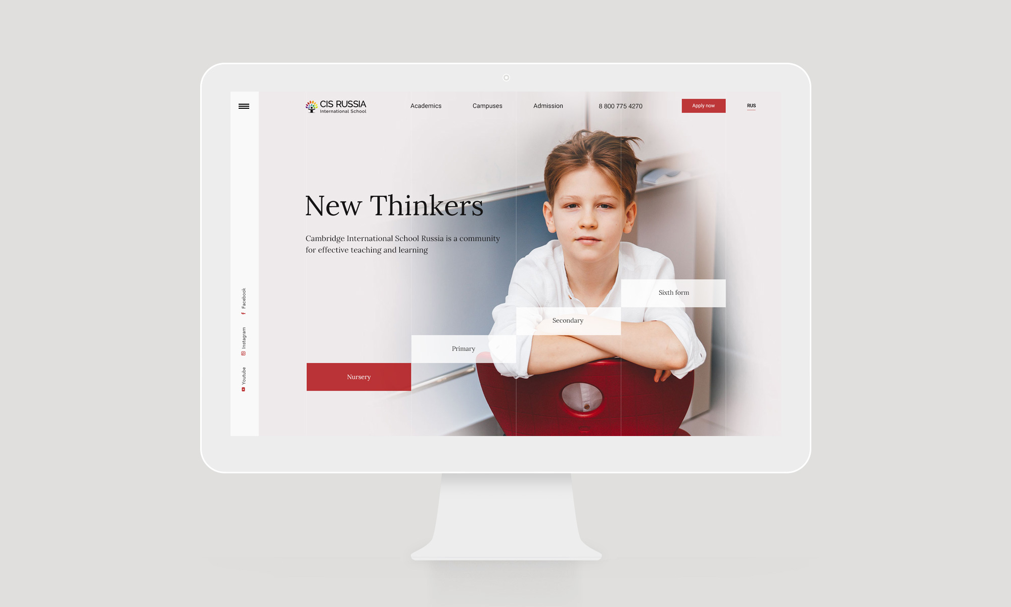
The old website had been looking like an American school, not an English one. One of the purposes of our work was to establish a visual perception of Cambridge’s style, and make it both modern and traditional at the same time.
Awards & Recognition
Honorable mention
Mobile Excellence
Special Kudos
Best UI/UX & Innovation
Our method is to bridge the gap between user goals and business goals.
Insight
Working collaboratively with CIS’s marketing department, we interviewed administrative personnel of campuses and took a poll of parents. Their feedback helped us to create an informational structure of the new website that meets users’ expectations.
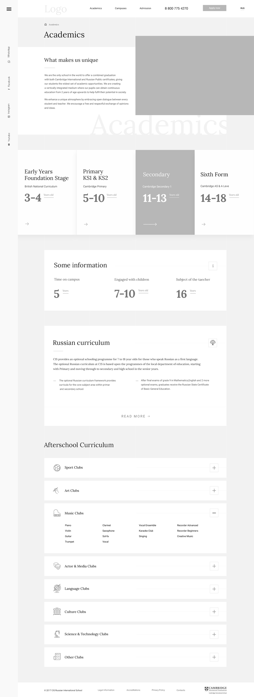
We found that parents wanted to know more details about the curriculum
and
We discovered which forms of contact parents prefer and in which cases: phone, messengers, email, forms.
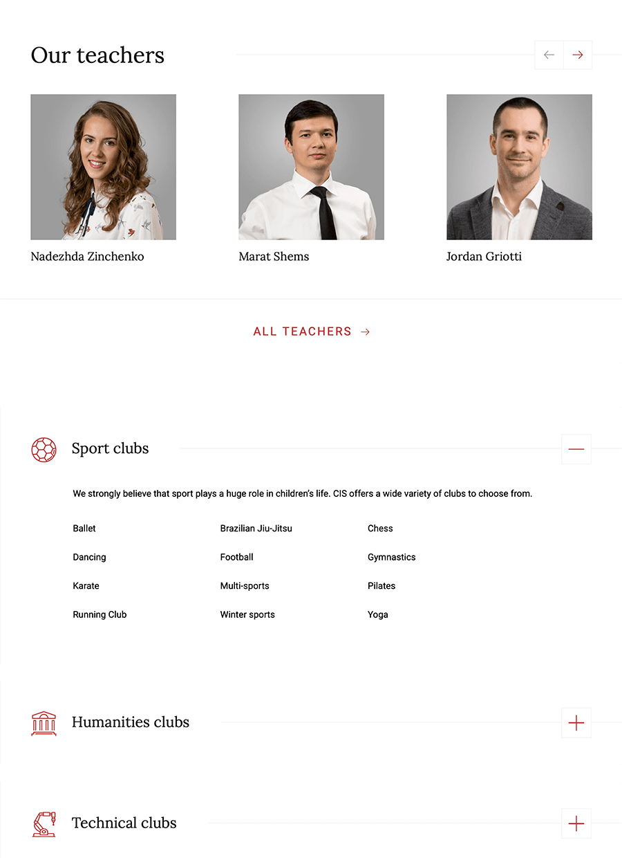
We proved a hypothesis that parents had felt there was a lack of information about teaching staff.
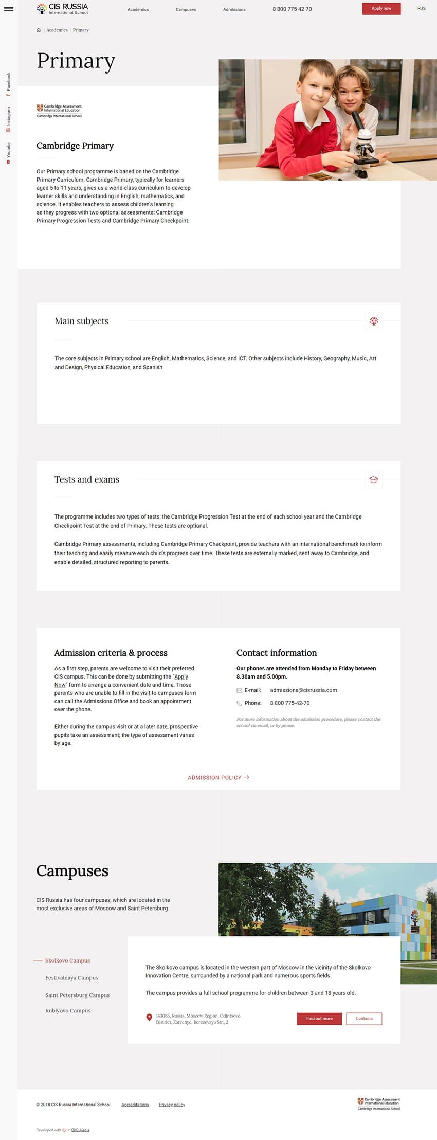
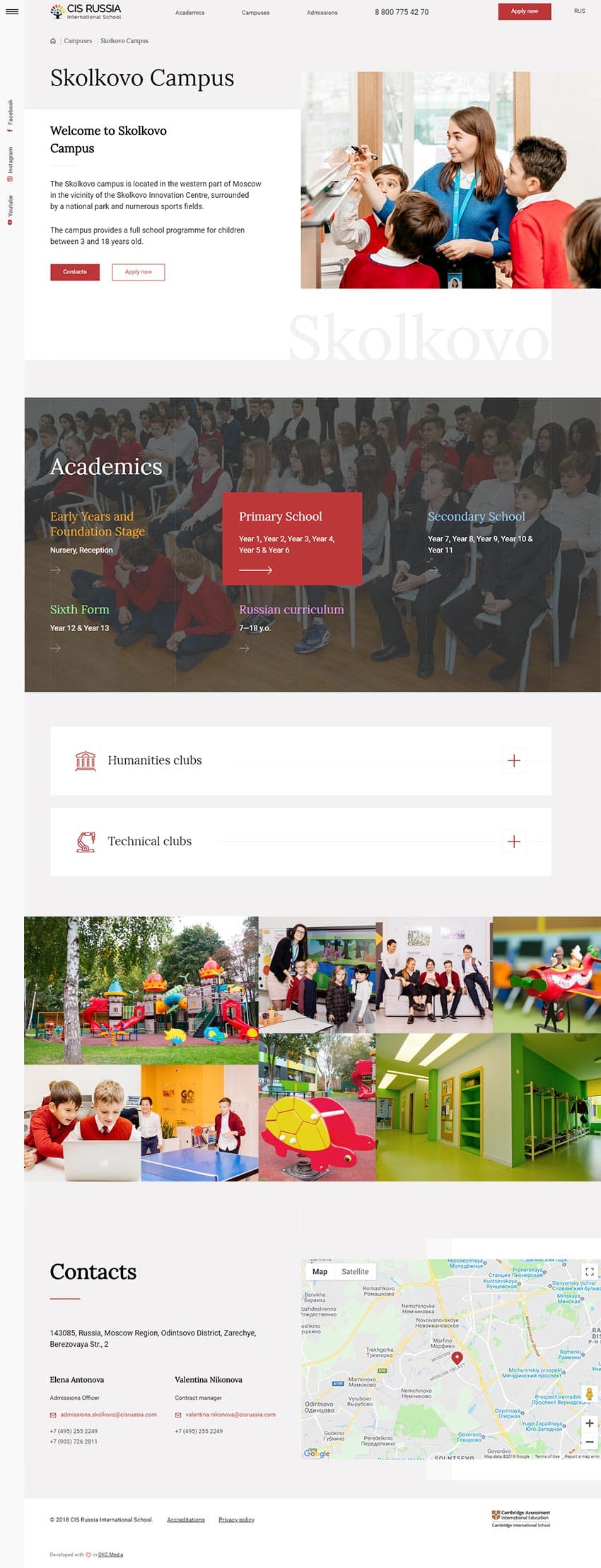
Keeping in mind users’ needs first of all, we offered a content system that is useful for search engine optimization for wide semantics, and shortening a user’s journey to target actions:
- Visible phone number — At every moment a user should be able to start a conversation with a specialist.
- Simplified application form — Before now, a user had to download a pdf document, fill it in, and send it by email, which was terribly
time-consuming and unnecessarily difficult. - Order a free test and campus tour — This was not obvious for a user on the old website.
Contacts in the context of the user’s behaviour — If the user is visiting the exact campus page, we offer them campus contacts. If they are interested in general information, we offer them HQ administration contacts.
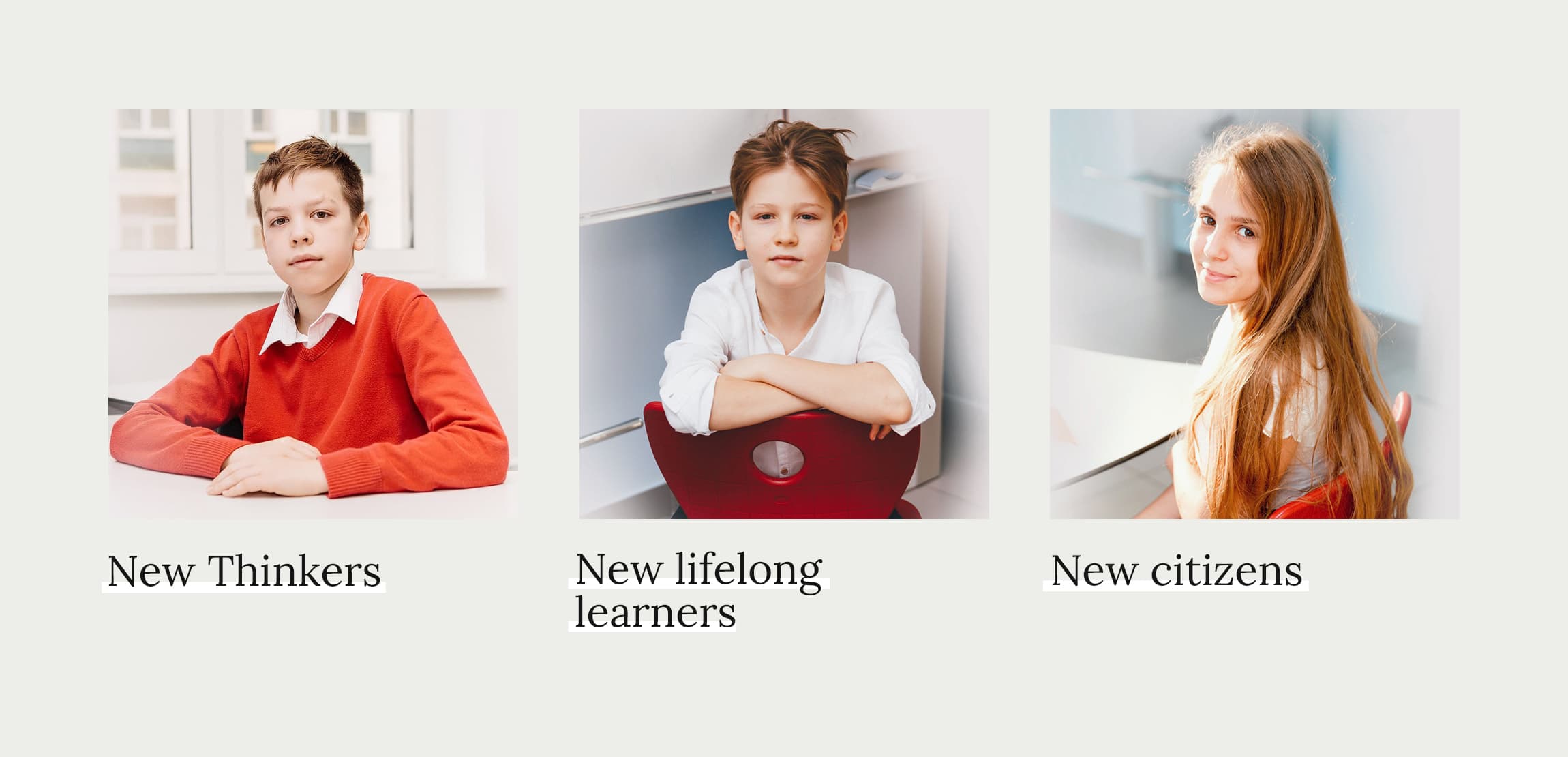
The mission of CIS is to equip students with
Our visual message is for those parents who wish for their children much more than just academic skills. That’s why on the first screen we show new students in branded school uniform, new global citizens, new
Design
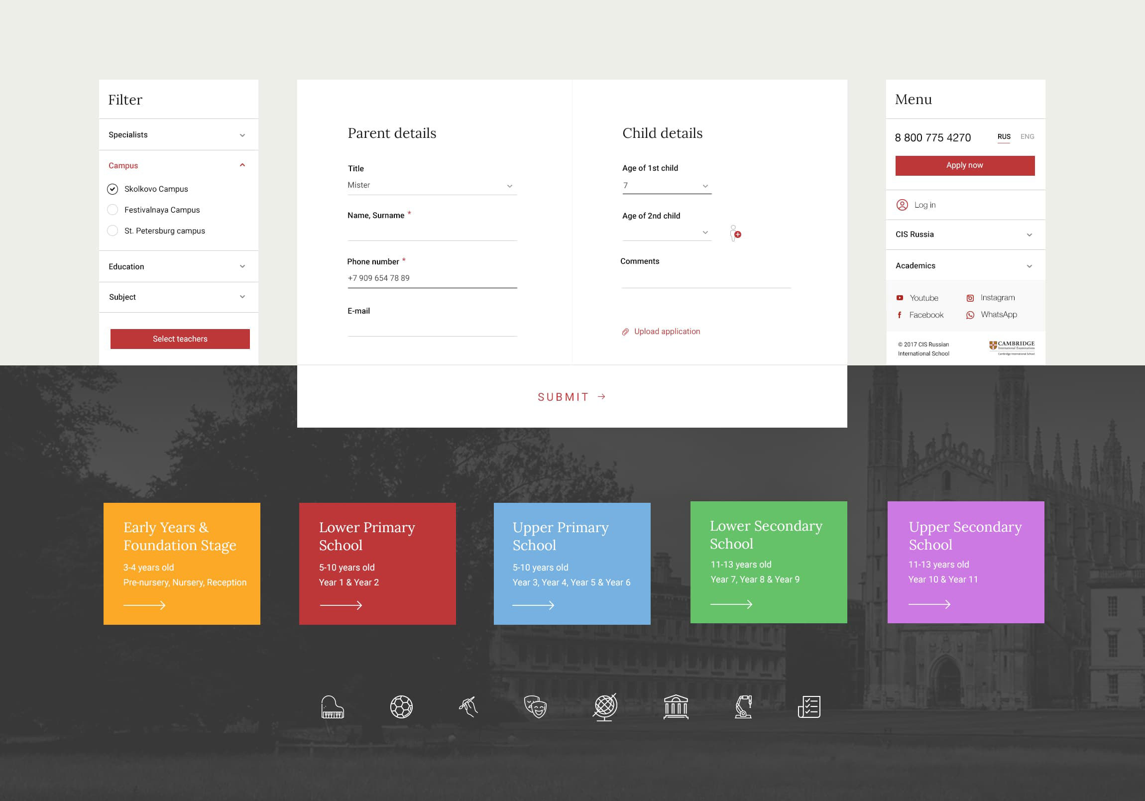
We created the effective design system across brand digital marketing efforts. The visual language is not an occasional one.
Before we offered a creative concept and UI, we researched the differences of the American and English style of schools and universities, and what the Cambridge style is about.
Grid, typefaces, and editorial images have all reflected the whole brand identity as an institution of traditional English education. Cambridge International School has a lot of content, and to avoid overloading users with information we have used our principle of informational sufficiency. We disclose information at every stage as we engage a user.
Campuses
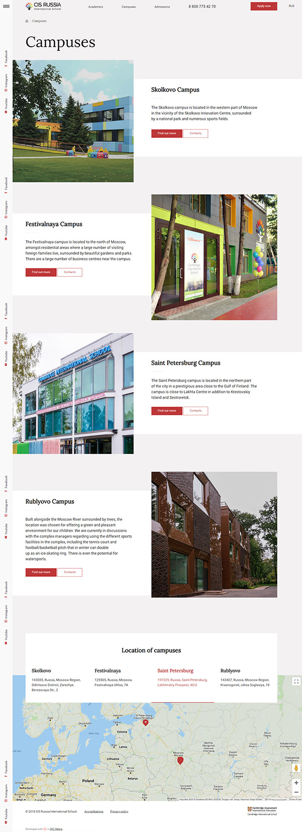
Location matters. Most of the pupils live or plan to live near campus. That’s why every campus page is filled with the specific information about the curriculum, teachers and
As a first step before applying, we offer parents and their kids a free tour on campus, and a test of their child’s level of education.
World of CIS
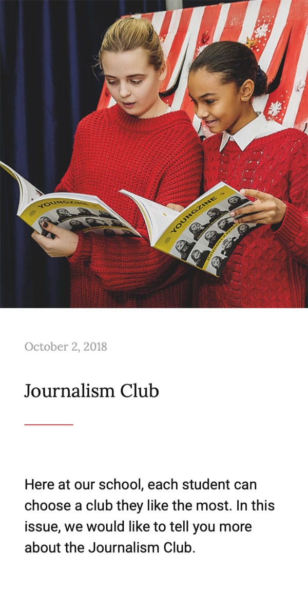
The School’s team makes a great Youngzine — a brilliant offline magazine that reviews books, publishes methodical articles and organizes professional events.
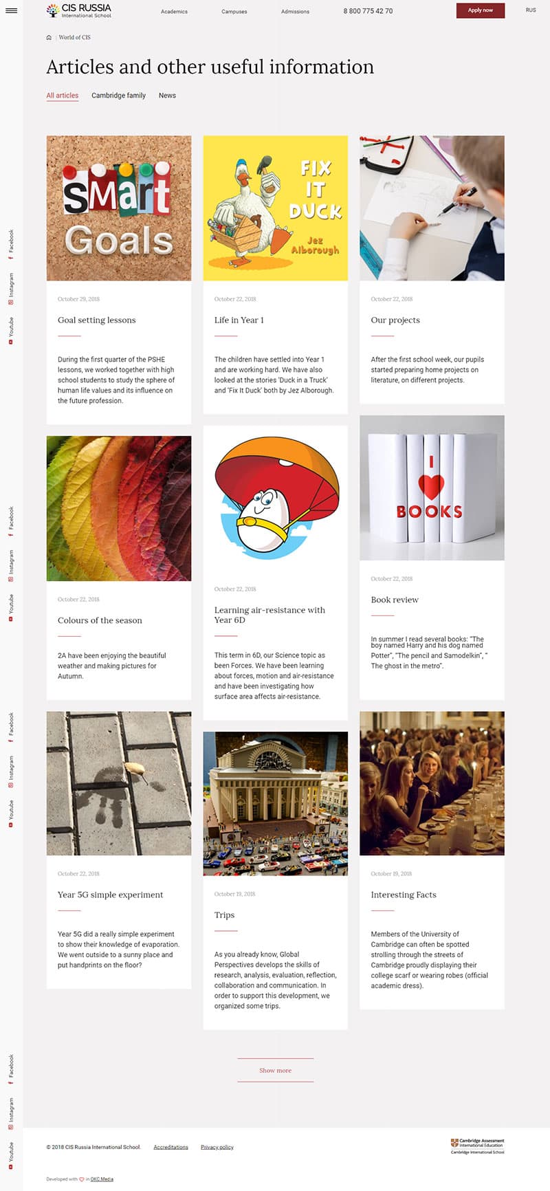
We transformed the somewhat modest News section of the old website to the World of CIS section, which reflects all of the deep and bright world where CIS pupils and teachers live. It is about inspiration and aspiration for parents, and present and future students.
Features
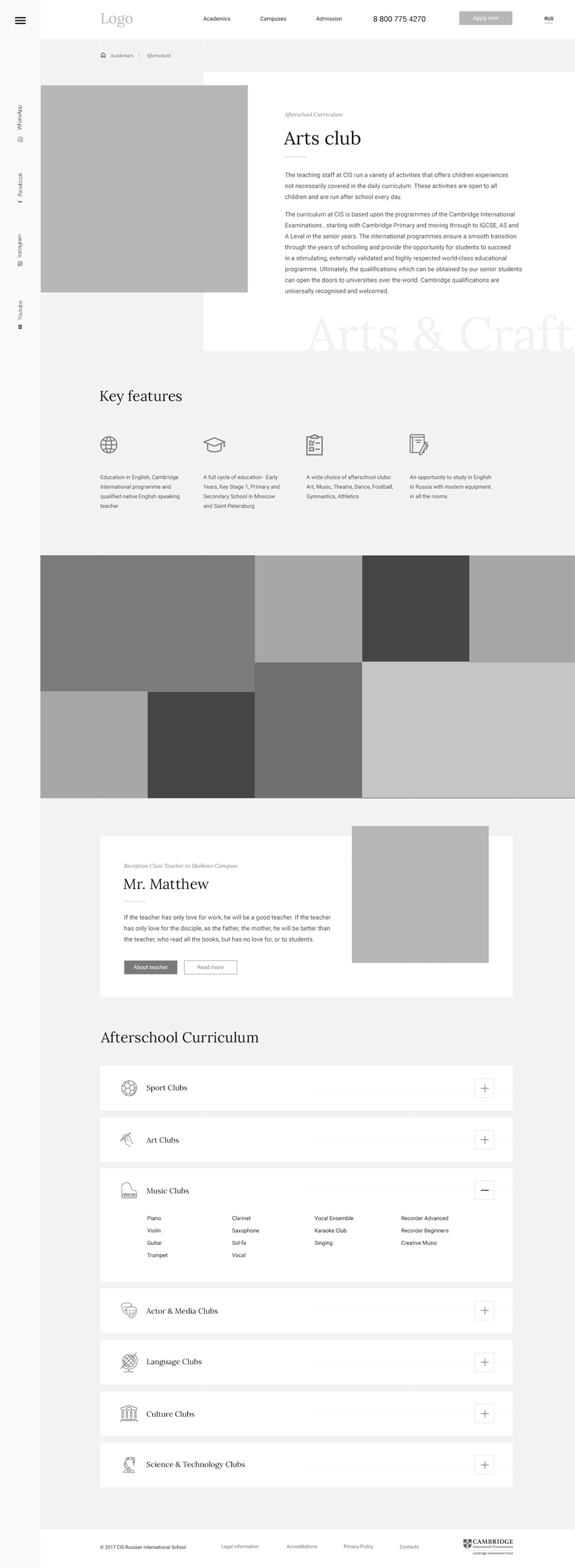
- Rich landings for Campuses
- Teacher's detailed pages
- User-friendly apply form
- CMS Bitrix
- SEO & Structural metadata
- AMP pages
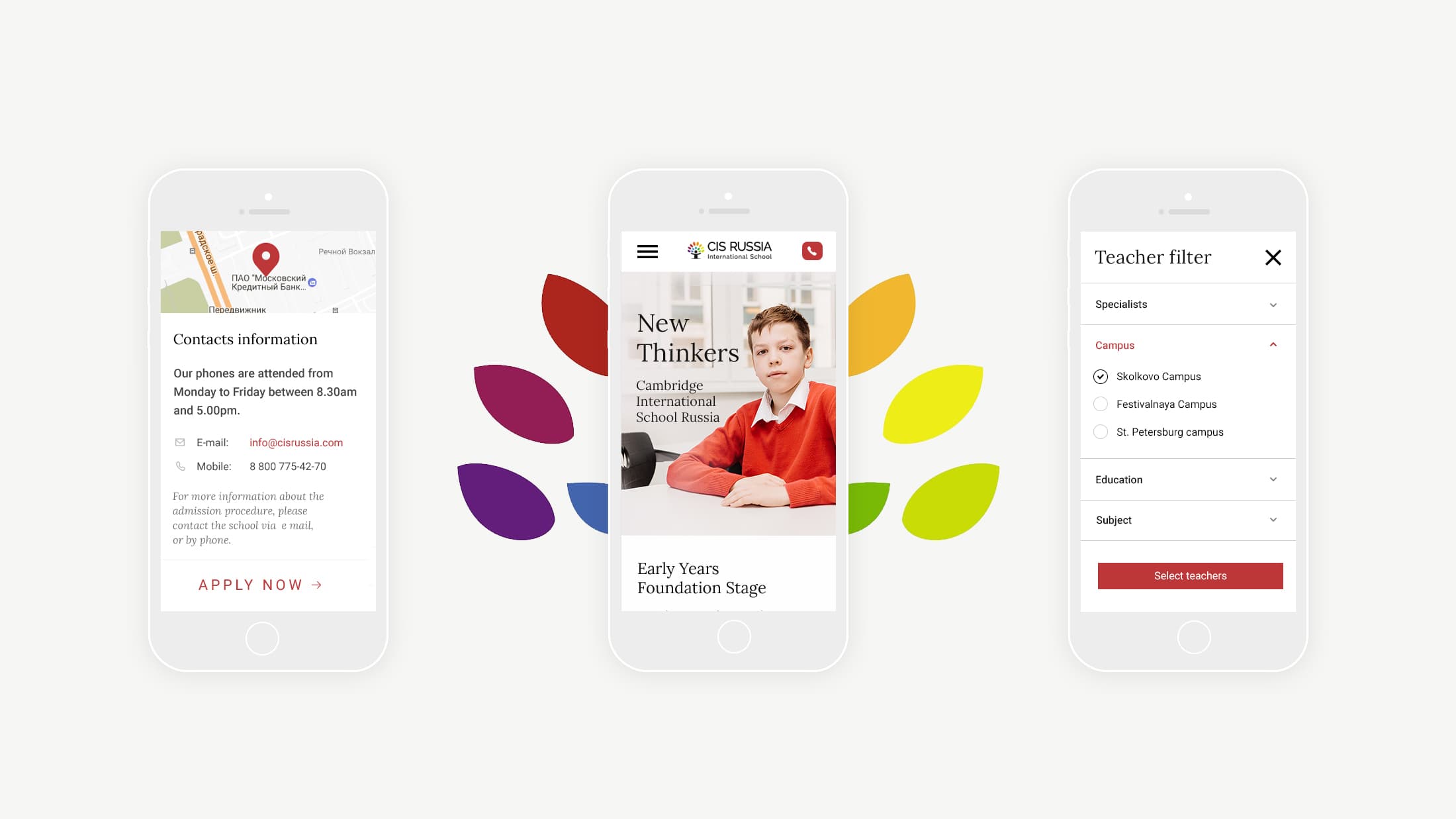
- Responsive design
- High performance user interface