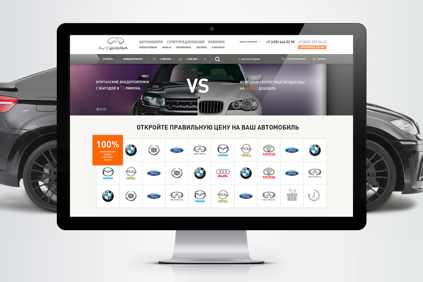
Avterra is an independent car dealer. Since 1996, partnerships with official dealers in different parts of Russia have been allowing Avterra to offer their clients the most favourable purchase terms. We led the strategy, concept, and design for the new website.
Goal
We needed to solve a challenging problem: develop a website design that would visually set Avterra apart from unconscientious “grey” dealers and help customers choose a car they want.
Quantitative indicators in need of improvement included the bounce rate, conversion, and the standard set for work with SEM.
Solution
The new website represents a customer tool that helps choose a car by comparing several models and configurations.
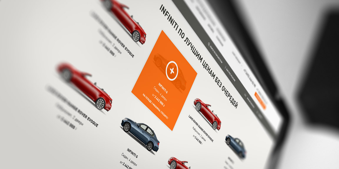
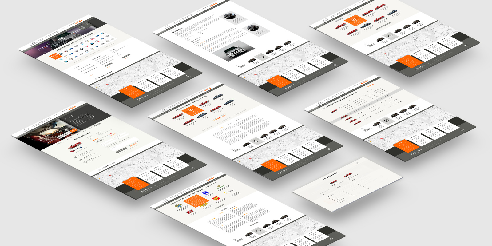
As a promotion tool, it is a sum of landing pages for specific models and configurations, as well as special offers and car selections united by certain parameters.

The user, as a rule, has several most important criteria in mind. We wanted the navigation to always answer the question: “What car should I buy?”
- Offroader for 2.5 to 3 million RUB
- Infinity GS convertible
Visitors that come through search engines have already answered this question. So, we lead them to a landing page. There the user immediately sees what is being offered, as well as the benefits of buying from Avterra. They can familiarize themselves with reviews of the car selected, its technical specifications, and exterior appearance.


Outcome
Our efforts to improve behavioral factors on the website united with client efforts to enhance advertising campaigns yielded most impressive results.
bounce rate decreased sixfold
Users spent twice as much time on the website
Visit depth increased by 2.5 pages