What makes a school website remarkable? What’s the role of the website in a whole school strategy? We sort out ten inspiring examples of schools and universities with their websites.
We’ve studied dozens of websites during our work for the Cambridge International School, and we want to share not only brilliant design examples, but the content and user experience of schools’ websites.
What makes a school or a university website remarkable?
Useful. The website must have a clear role in a marketing and communication strategy of a school.
Functional. That includes united content management, a design system, CRM, analytics; all are necessary to use a website as an everyday and integrated instrument of a school’s activity.
Accessible. It’s a wide concept that was explained at Google Web Fundamentals. To make a long story short, a website must be pleasant and easy to use for all users. Website performance, mobile and desktop user experience, and typography are all things that matter.
Visually attractive. A design system unites all the components around a common visual language. Layout, photos, videos, and copy create a perception and identity of a school or university and influence the user’s decisions.
A great website for a school must serve quite different audiences: current and prospective students, parents, staff, and regulators. There is a lot to navigate and it’s the essential part of UX design to lead every user with an intuitive way to the required information.
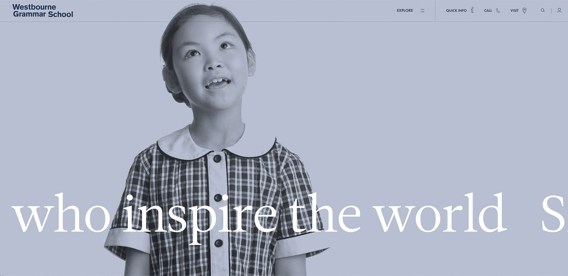
1. Westbourne Grammar School
We liked:
- clean design and visual messaging;
- Quick info menu;
- friendly page on «People» showing a team;
- history told by teachers and students.
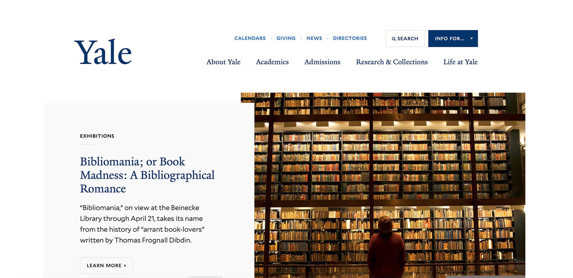
2. Yale University
We liked:
- minimal and clean layout;
- quick links at «Info for…»;
- Student Life at Yale about studying, rules, and activities at the university.
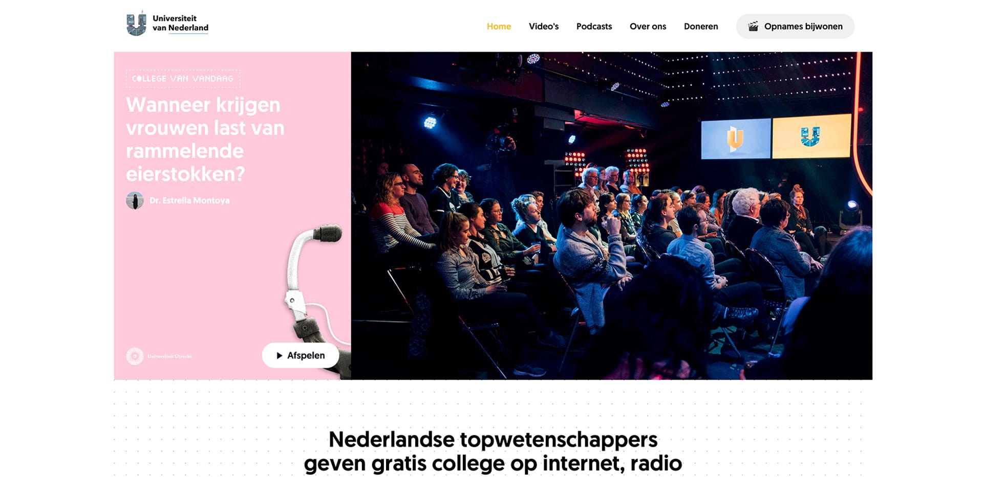
3. Universiteit van Nederland
So many interesting lectures are given in Dutch universities. Why is this knowledge available only for a small audience of students? Why not share this knowledge among everyone in the country? Some years ago two founders of Universiteit van Nederland came up with this question, and for today the website contains more than 600 inspiring lectures from top scientists. We liked:
- free online education trends that follow such leading projects as EdX, MIT Open courseware, and Udacity;
- Content strategy and editorials. It looks not like an educational platform but the aspiration for prospective students;
- funny and interesting design.
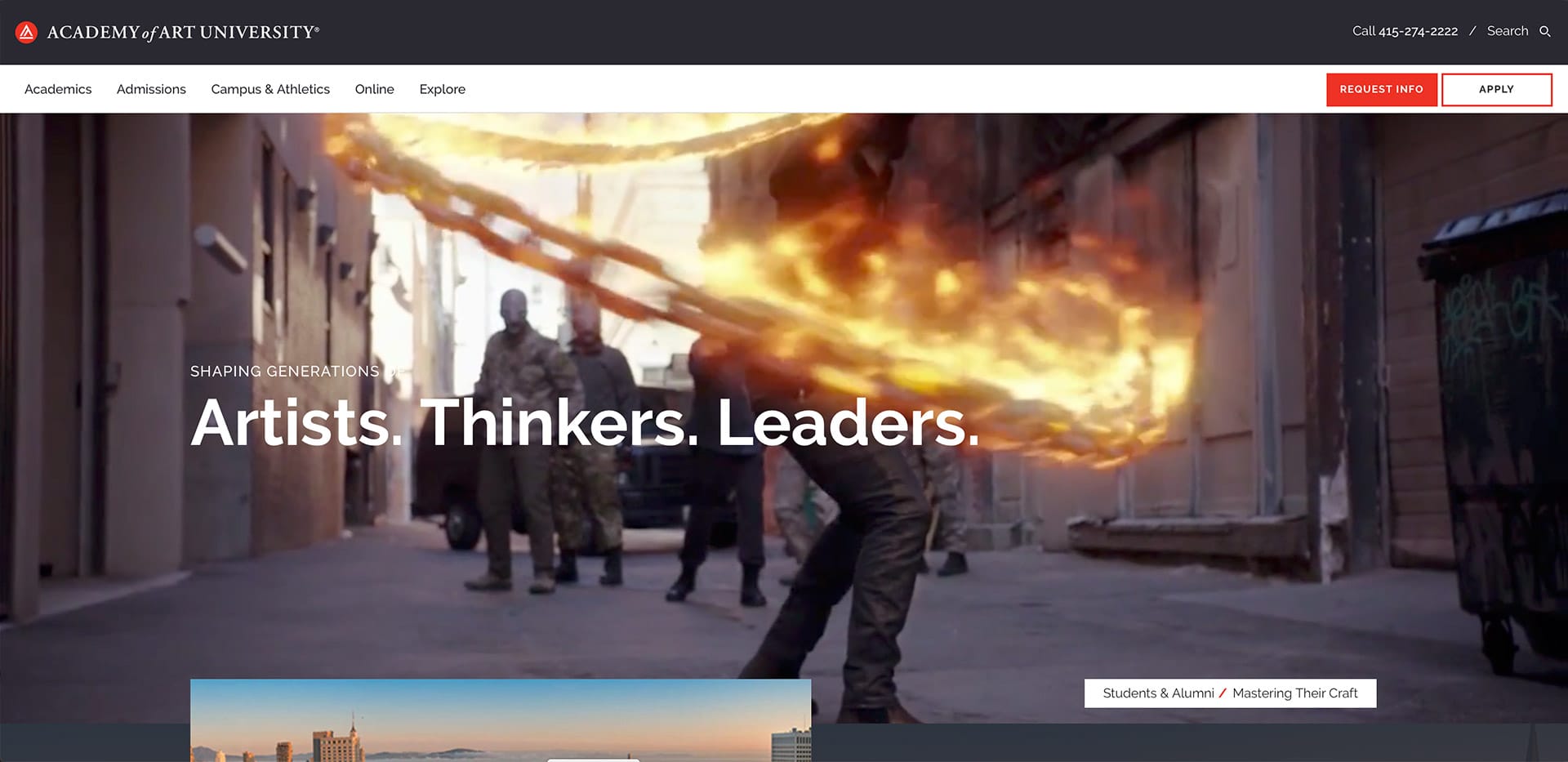
4. Academy of Art University
We liked:
- strong messages such as «Shaping generations of…» that are multiplied in a video.
- well designed website structure, both simple and engaging.
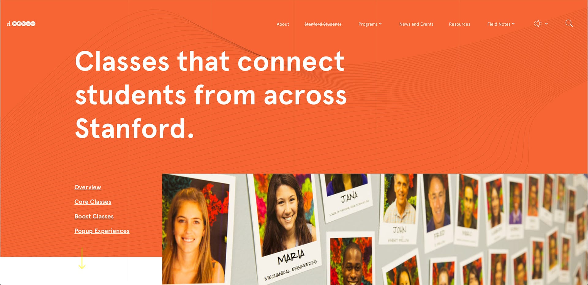
5. Hasso Plattner Institute of Design at Stanford University
We liked:
- clean design;
- detailed program pages with such things as «you should apply if…», team members, real-world applications, tools, and FAQs that discover the product from all sides;
- Our point of view page with clarified mission and values of the Institute.
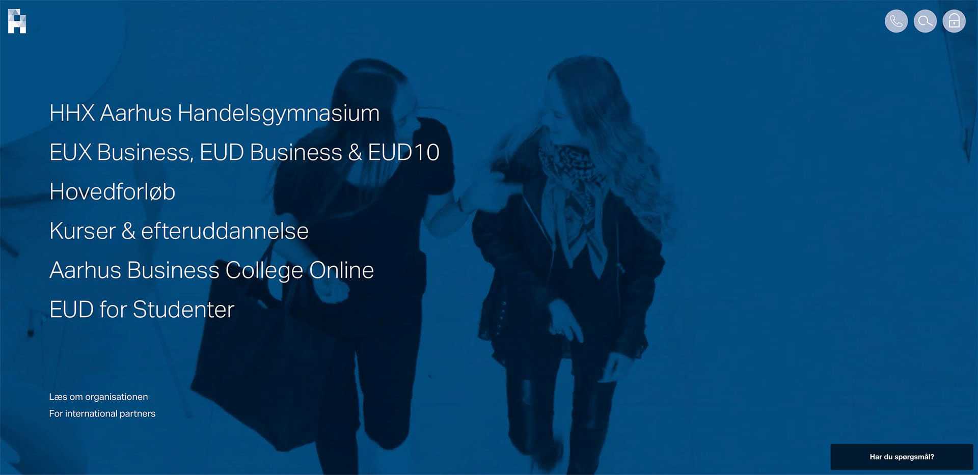
6. Aarhus Business College
We liked:
- perfect interactive and video usage;
- remarkable design;
- very simple to navigate with business-style content.
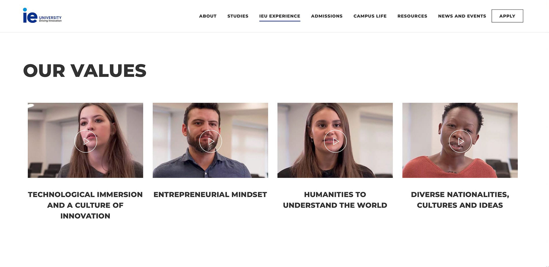
7. Instituto de Empresa
We liked:
- IE Alumni: the whole community for students;
- values of the institute explained by masters in video messages;
- detailed program pages;
- clear step-by-step application.
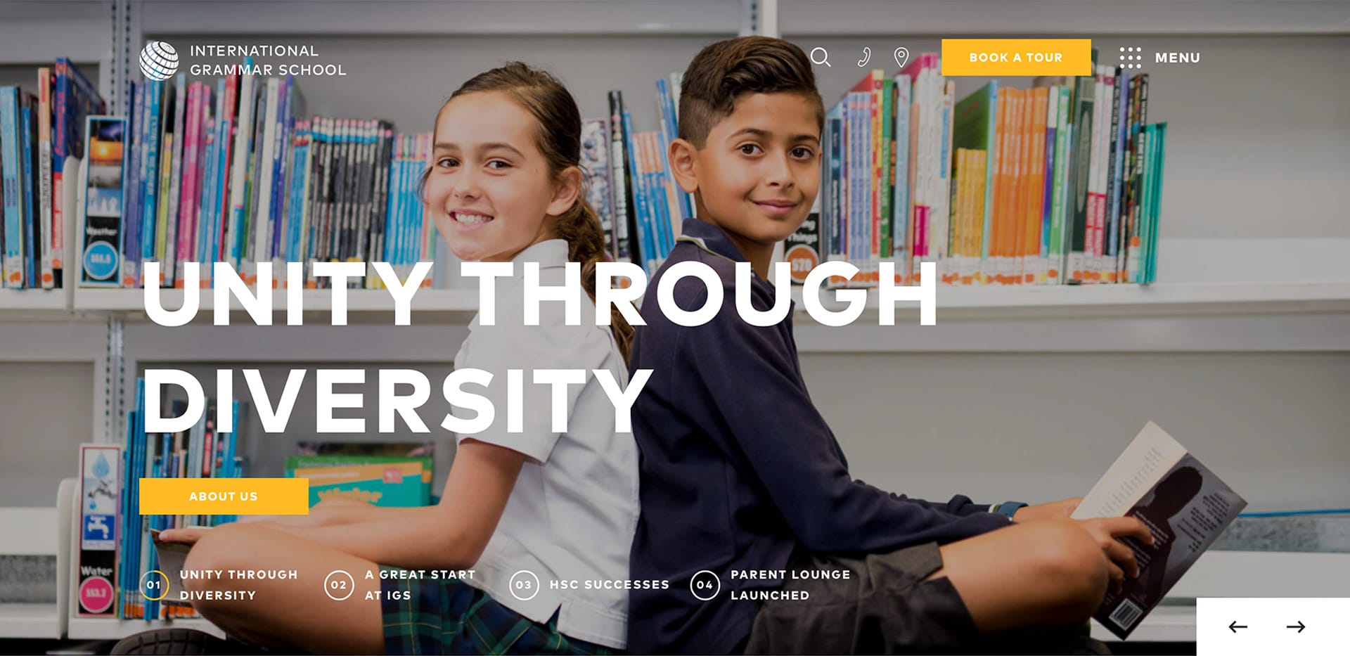
8. International Grammar School
We liked:
- clean design;
- modern and easy to use; interactive;
- well-structured part of the website for parents.
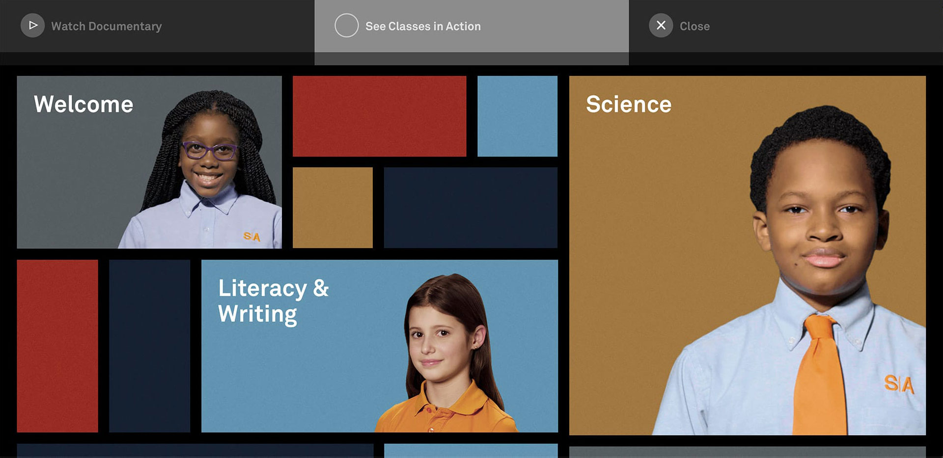
9. Success Academy
We liked:
- the opportunity to see the Academy through the eyes of students;
- brilliant way to create a navigational menu: students tell about their favourite subjects and classes.
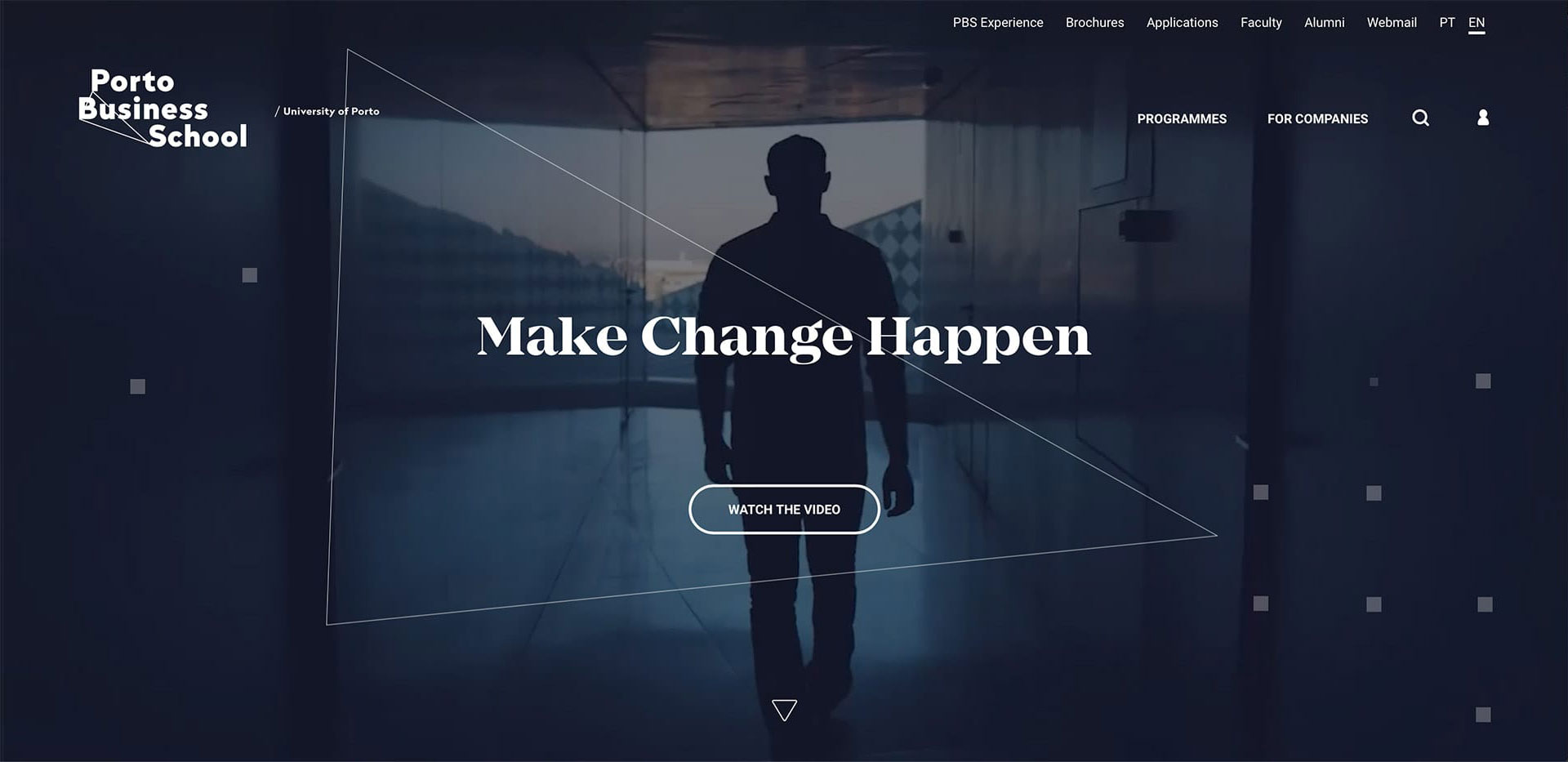
10. Porto Business School
We liked:
- clean design and UX;
- well-structured and detailed program pages;
- convenient searches for a program;
- quiz helping prospective students choose a program.
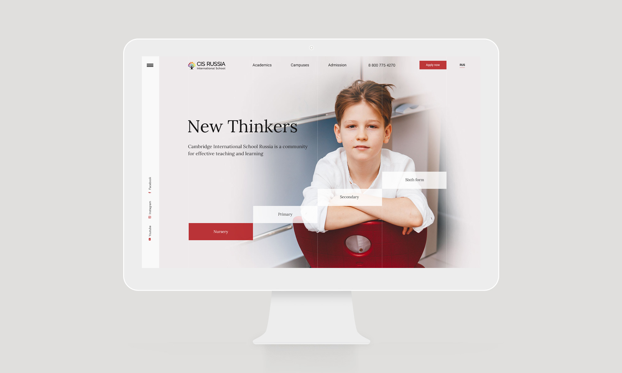
And finally, we'd like to share our work for the Cambridge International School as the result of this inspiration:

