What does an artist in the state of inspiration and a user visiting a web site have in common? Why are some interfaces user-friendly and others make us look away?
Interface flow
In 1990, Mihály Csíkszentmihályi described the state of flow that people get in when they are fully immersed in an exciting activity and enjoy what they are doing. This state emerges on the border between “too simple” and “too difficult”.
This state is familiar to athletes, artists, musicians and business people. Anyone can experience it given the right conditions.
Searching for information, playing a game, reading, or shopping online can also be accompanied by this state of flow. It allows people to not only solve their problems more efficiently, but also to evaluate their user experience in a more positive light:
- Activity is seen as a reward in itself
- They find satisfaction in carrying out actions
- They zone out from the external world
Factors responsible for creating the state of flow help us create perfect user interfaces.
Toxic interfaces
The external world is the first “user interface” that any person interacts with from the day they are born. The laws of such interactions are viewed as “natural”.
How would one feel when an object behaves contrary to one's expectations? It evokes the feeling of danger. It gives an idea that the object should be avoided. That is why people refuse to use imperfect, “toxic” interfaces.
In this article you'll learn how to support the state of flow with the interface's natural reactions to human actions.
Interaction time
Three flow factors correspond with interface reactions:
- Attention focus
- Immediate reaction
- Sense of control
The physiology of perception dictates that each factor has its own time frame.

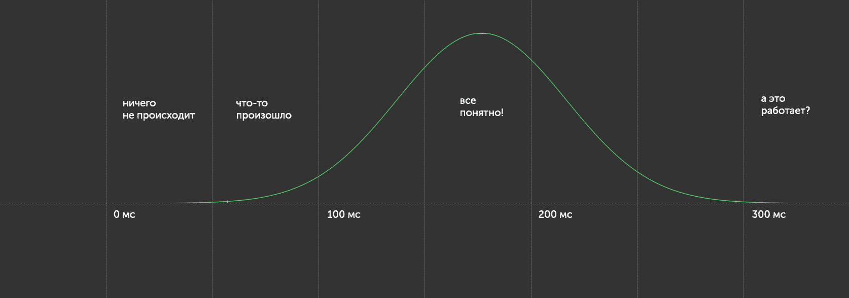
40 ms: subconscious phase. That's when the person decides if he or she likes an object, but cannot yet realize this decision or notice any changes in the object.
60 ms: attention phase. That's how long it takes to pay attention to the object without a conscious reaction to the stimulus.
150-200 ms: conscious phase. The person understands what has happened and exercises conscious control over the situation.
>250-300 ms: losing focus. It's common knowledge that even if we try to focus, eyes stop executing rapid movements for split seconds only.
Reaction
Changes in the interface that are too quick can go unnoticed or cause trouble with understanding. That's why reactions should be neither too fast nor too slow, but scheduled in time.
The attention phase should correspond with noticeable changes in the interface, no less than 20-30% to the total change of the object, its form, colour, and placement. The optimal time for this phase is 60 ms.
If the object has changed and returned to the previous state in less time, it will be noticed only at the unconscious level, which exceeds the limits of interface design and relates to a very different sphere of interactions with users.
Attention focus
The total time of realization takes 150-200 ms. This is the perfect time for full interface elements reactions.
Animation that is faster will be viewed as immediate, and therefore will subconsciously be treated as a warning sign. The quick reaction of several elements with a focus change is experienced as false activation.
Sense of control
Studies in interface operation done as far back as the 1980s showed that 350ms represents the longest viable waiting time for system reaction. Before the user starts to think “Does this thing even work?”
Examples
Conclusion
- Interface reactions should not be immediate lest they lead to mistakes and negative user experiences.
- Transitions from one interface element to another should ideally take 180ms.
- Reaction time cannot be too long, and should be no longer than 350ms.


