How do users feel when they try to open a section in the website menu and can't?
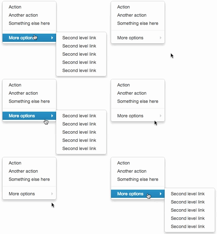
A generic menu behavior that may cause irritation is when it suddenly closes, following an attempt to put the cursor on a submenu item.

Classic example: menu in Bootstrap.
Think major companies avoid this mistake? Well, think again. This is one of the most common problems with hierarchical menus. You can start as early as at the operational system of your computer.

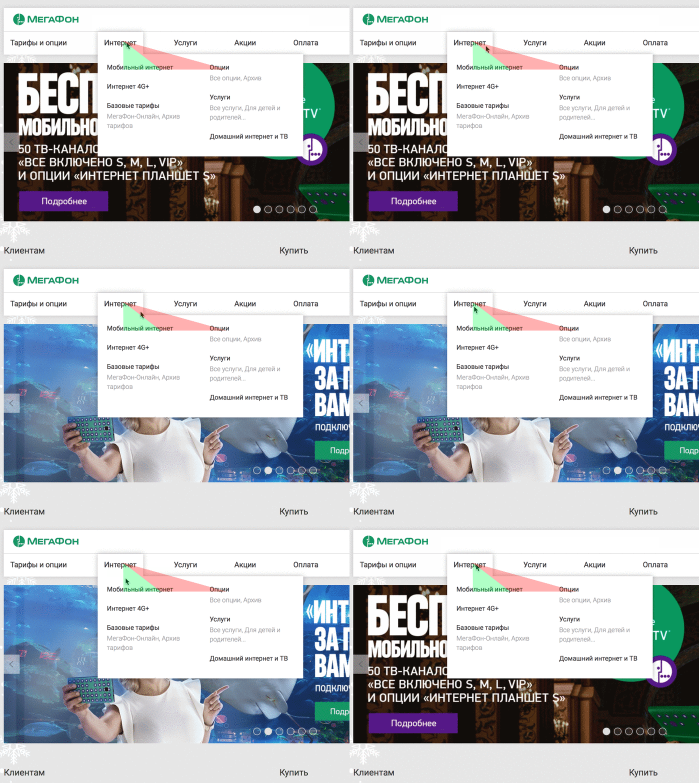
Megafon.ru menu: an attempt to choose the Options submenu closes the Internet tab. The user has to lead the cursor on a zig-zag trajectory.
- Extensive menu. The user inevitably crosses one of the tabs, and the drop-down menu covers the whole screen.
- Section names consist of two words, which leads to a high probability of accidentally touching the next tab when opening a menu section. Visually it is perceived as “twitching”.
Many websites use hoverIntent, a plug-in that creates a small delay for mouse actions. In our case it did not solve the problem: the menu just took longer to respond, while an acceptable result was achieved when the user moved the mouse across the screen fast enough.
The solution was to evaluate mouse cursor trajectory to find out when one needs to open the menu or to go to a next tab.
This solution was most likely first implemented by Bruce Tognazzini when he was working on NeXT and Mac OS operational systems:
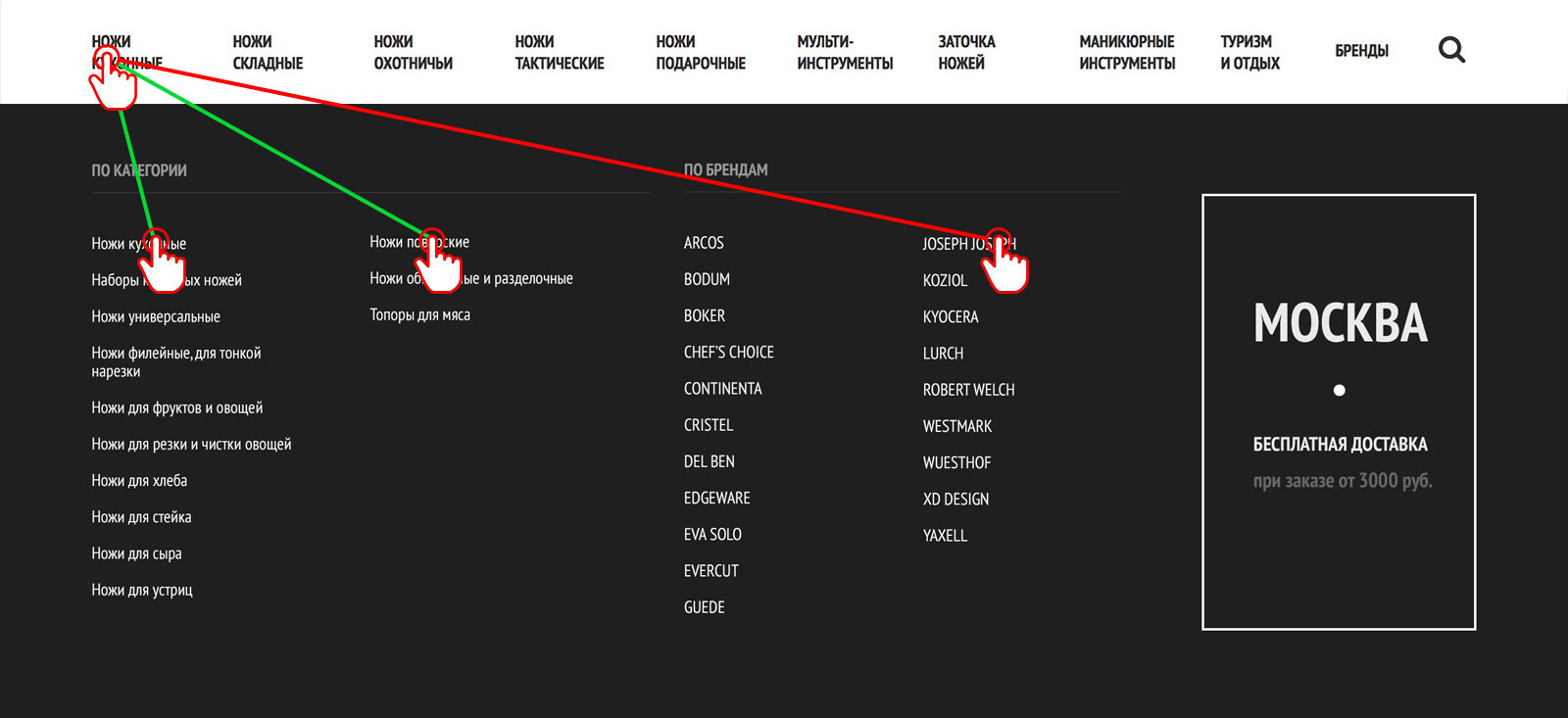
Luckily, we did not have to create the solution from scratch: it was taken care of by Ben Kamens with his great plug-in Menu Aim and an exciting story of its development. This plug-in is used, with several modifications, on the Messermeister platform::
- Menu tabs react only when the user lets the cursor rest on them. If the user simply moves the cursor across the screen and touches the menu, it does not open.
- At each point in time a “triangle” is created, based on the cursor position on the menu tab and the last right and left submenu items. If the cursor moves within the limits of this triangle, tabs do not change. In this case it does not matter how fast the cursor moves.
- Natural response for menu elements in 200 ms is used.

Just 5 Kb of compressed code created a totally different user experience with primary navigation elements. A small thing, but a big change!
Buying decisions at an eCommerce platform are made based on the overall experience of interaction. This emotional response is related not only to the prices and products, but also to the interface the user has to interact with. A solid, predictable and natural interface would never lead to a lower desire to buy. A badly executed, irritating and confusing interface may kill that desire.
So, try to see how the interface of your website makes users feel!
