Top 10 outstanding websites of schools and universities
We have selected ten examples of school and university website design. We look at page layouts, navigation and content: what makes a first impression, and what helps people find programmes, teachers or admissions requirements.
We put together the original selection while working on the website for Cambridge International School. In September 2026, we revisited the selection and updated the screenshots. It now includes nine current websites and our archived project, with a closer look at the decisions behind our work. The numbers indicate the order of the review, not a ranking.
What we look for in school and university websites
A website should give you a sense of a school or university and whether it might be right for you. Parents look for teachers, fees and school life; prospective students want programmes and entry requirements; current students need answers to everyday questions.
We look at navigation, typography, photography and how interaction is used. A large university is already a complex organisation: its interface should make the right section easier to find. Mobile usability and accessibility matter too, though assessing them calls for a separate technical audit.
1. Westbourne Grammar School
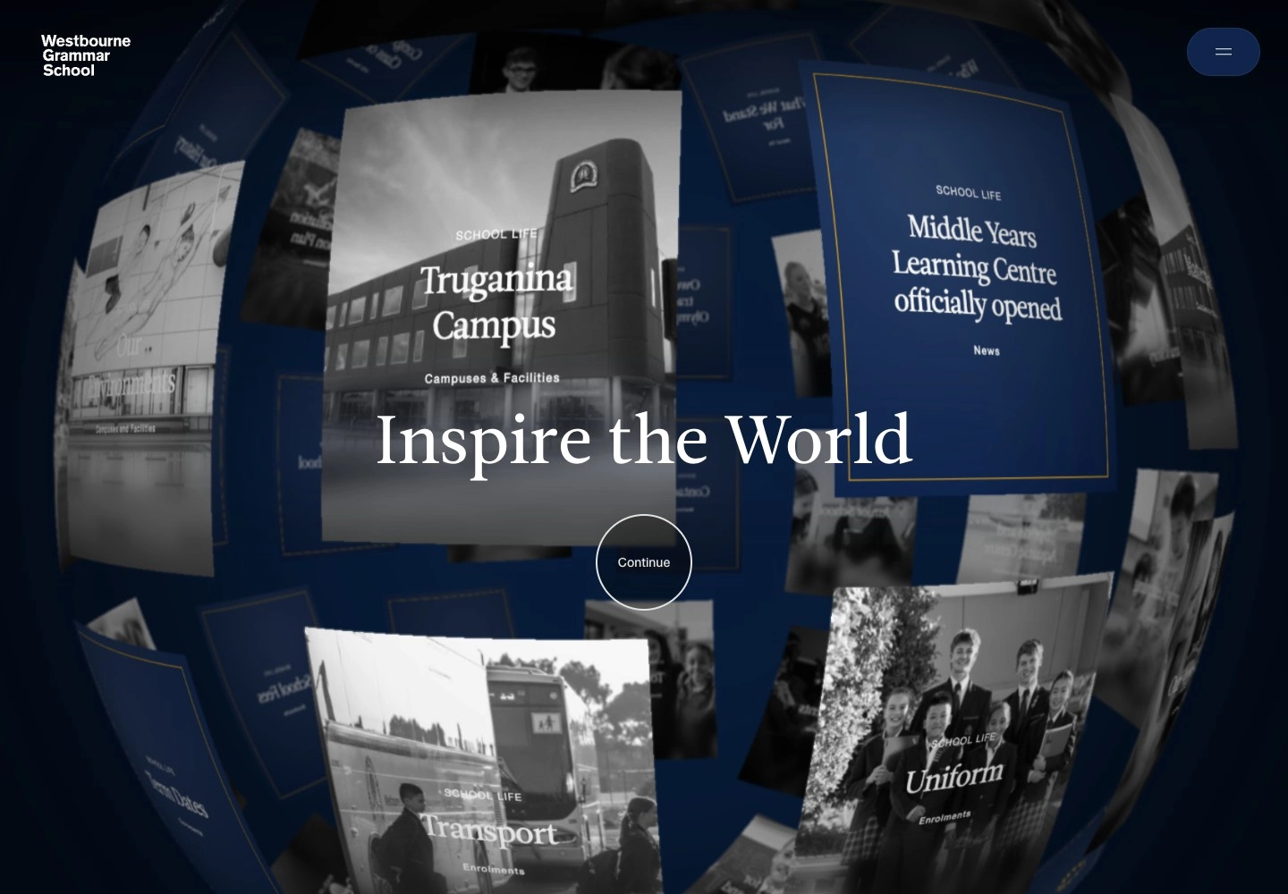
Westbourne opens strongly: school life in an animated introduction, restrained typography and a clean composition. You see people and their activities before reading the details. For a private school, that matters: parents are choosing the environment where their child will spend much of the day.
From there, you can choose your role and interests, read about admissions or book a tour. The unusual interaction helps you find your way rather than becoming an attraction in its own right. Still, the large intro will not suit everyone: if you arrive with a specific question, it may feel unnecessary.
The inner pages are noticeably calmer, with clean layouts, restrained typography, a clear structure and specific answers to parents’ questions.
2. Yale University
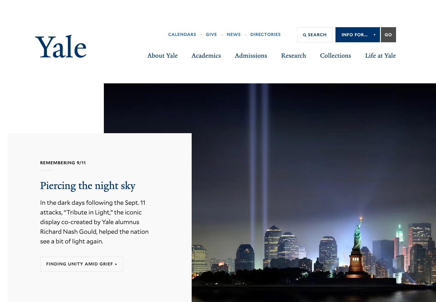
Yale’s information design still appeals to us. This large university portal uses calm typography and a clear hierarchy: study, research, collections and university life do not compete for attention. Routes for different audiences offer another way to find what you need.
The Info for… menu lets you start with your role. You do not have to know how the university is organised or which department handles your question.
3. International School of Zug and Luzern
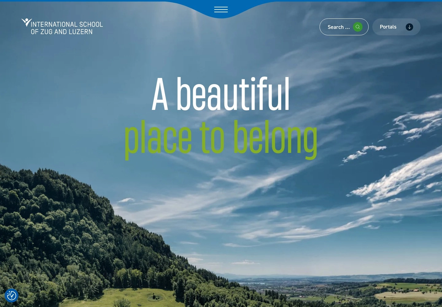
There is plenty to explore at ISZL: campus photography, lessons and the life of the school community. Condensed typography and soft shapes support that picture without drawing all the attention to the design.
The sections follow the school stages: primary, middle and high school. Within them are answers to parents’ academic and practical questions. But the photographs sometimes take up too much space: even on the fees page, a large image comes before the terms. At that point, we would welcome less atmosphere and more detail.
4. Rhode Island School of Design
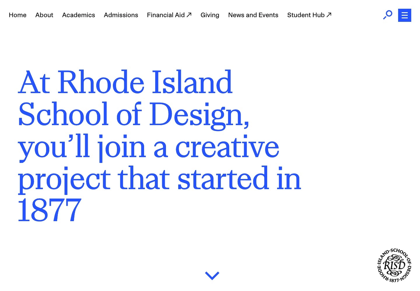
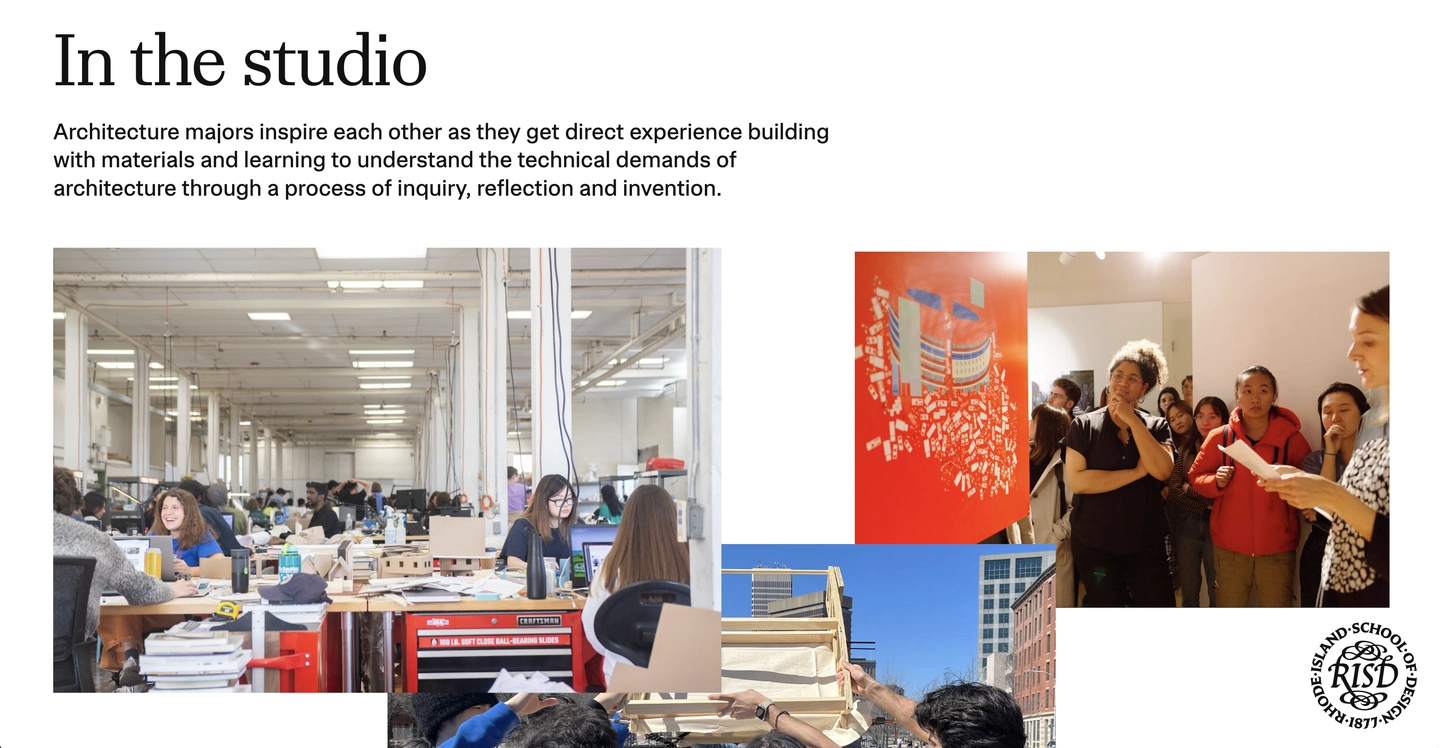
Large typography, a distinctive blue and student work give RISD its character. The art and design school shows what people come to study there for: creative practice, the people involved and the results of their education.
Programmes, the museum, and stories from students and alumni provide enough material to get a sense of the school. We like this reliance on the institution’s own life. A designer has plenty to work with: the job is to select the material and decide what deserves emphasis.
5. Phillips Exeter Academy
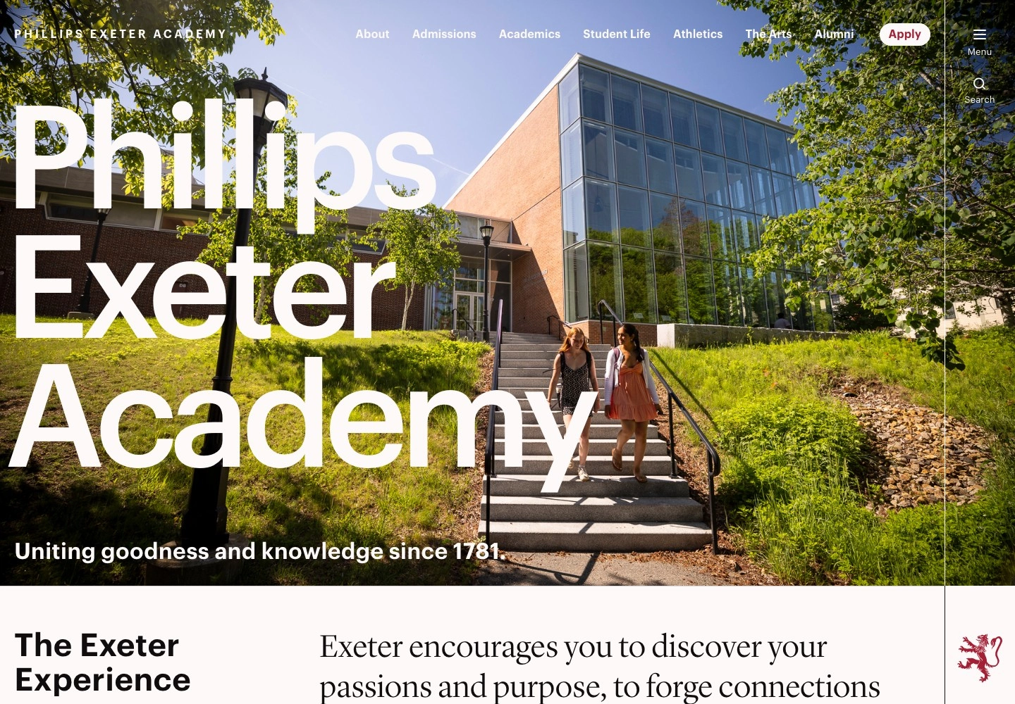
At Exeter, we would look beyond the homepage. It is expressive, with large type, campus photography and a limited palette. The main sections are visible in the open navigation. But the inner pages are where the site becomes particularly convincing.
How to Apply brings together application steps, deadlines and contacts, with a table of contents at the side. A complex process becomes a clear document that applicants can return to as they prepare. When it is time to act, the presentation becomes denser and quieter.
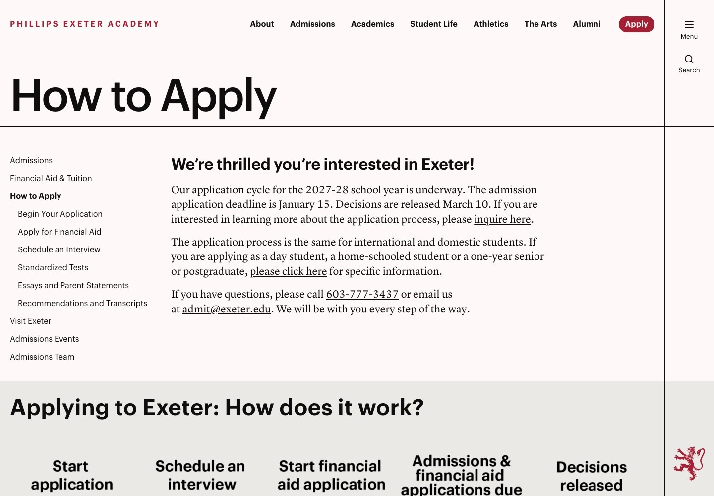
Exeter: contents, deadlines and application steps on the How to Apply page.
6. Stanford d.school
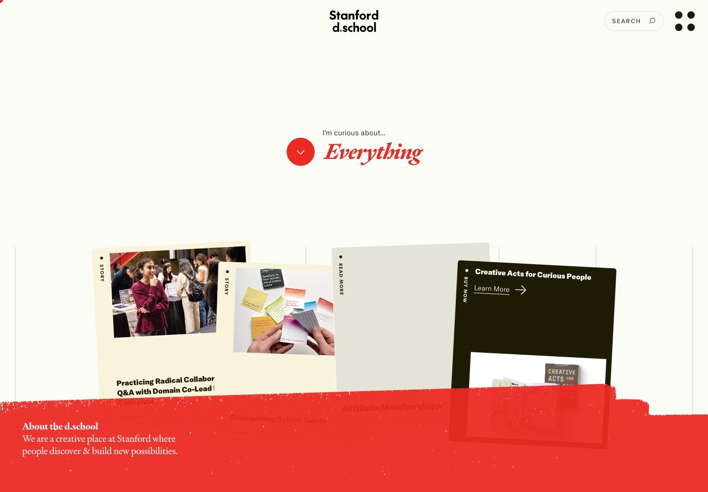
Stanford’s Hasso Plattner Institute of Design, known as the d.school, has its own visual language: cards, textures and expressive typography. Stories, programmes and practical tools are arranged in a way that recalls a creative workshop.
You can start with what you want to do: study design, apply it at work or find teaching materials. The tool library lets you try the school’s methods in practice. The school becomes useful to people long before they apply.
7. Brighton College
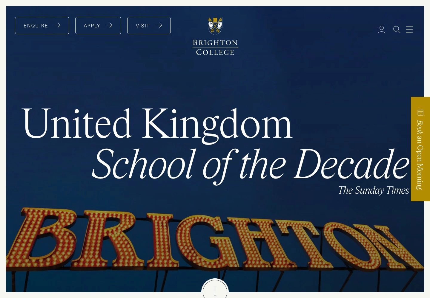
Brighton has a formal presentation: serif type, deep colours, large photographs and a clear emphasis on the school’s reputation. Enquire, Apply and Visit sit in the header, so you can ask a question, submit an application or plan a visit straight away.
Education is divided into age groups, with an invitation to get to know the school at an open event. Behind the traditional design are clear next steps for parents. We would tone down some of the oversized headings and promotional statements, particularly on pages where people need a specific answer.
8. IE University
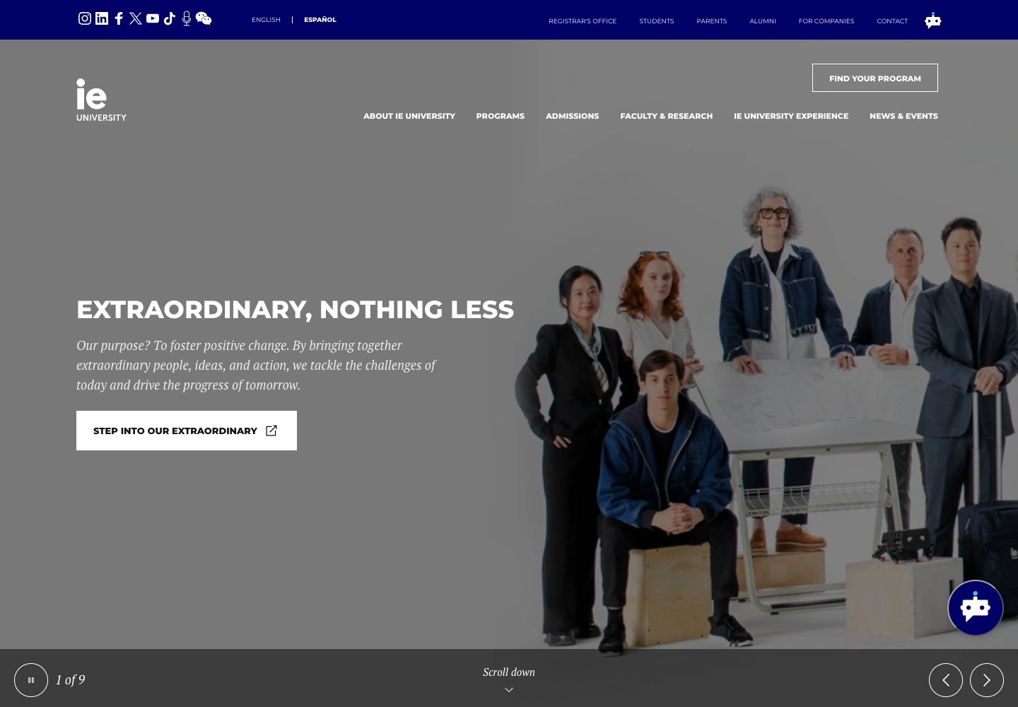
IE looks conservative. What interests us more is how it organises the choice: subject areas and levels of study, programme search and comparison, admissions requirements and financial support.
If you are not ready to decide, you can speak to students and staff. A site like this is best assessed with a particular programme in mind: can you work through the requirements and get your questions answered? That is what determines whether its restrained presentation earns its place.
9. Ravensbourne University London
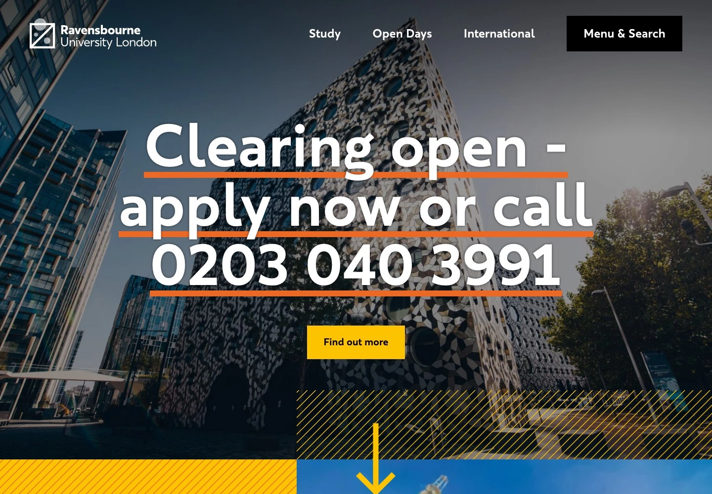
Choosing a university is rarely a decision made by one person alone. Ravensbourne reflects this in its navigation: parents have dedicated routes to information on admissions, funding, life in London and student support.
Student projects, work with companies and alumni stories connect studying with future employment. They give a sense of what students do here and where it might lead after graduation.
10. CIS — our approach to a school website
Our project for Cambridge International School
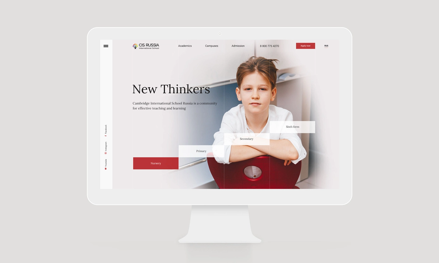
For CIS, we started with parents’ needs and their traditional expectations of a school website. They need to understand quickly what children learn and how, who will teach them, what tuition costs and how admission works.
Educational programmes and campuses therefore became the foundation of the site. Each campus has its own page with details of the learning environment and a personal message from its head. Teachers have detailed profiles covering their education, experience, subjects and role in the school.
The visual language is deliberately restrained. It combines English academic tradition with the character of a modern international school, keeping the focus on programmes, people and school life.
Cambridge International School — archived version